
|
|
|||||||
| Comic Hero Custom Creations Any comic book customs and the discussions surrounding them |
 |
|
|
Thread Tools | Search this Thread | Display Modes |
|
|
|
#1
 February 4th, 2017, 02:43 PM
|
||||
|
||||
|
Re: Smurf along with me: la la la-la la la!
Quote:
EDIT: Whatever you do, don't lose the footprint for move, Its got to be my favorite part of the card. Check out my ebay where you can find my custom dice trays and dicetowers: https://www.ebay.com/usr/captainamazing_jerdo 
|
|
#2
February 4th, 2017, 11:27 PM
|
||||
|
||||
|
Re: Smurf along with me: la la la-la la la!
Quote:
|
|
#3
February 5th, 2017, 02:06 PM
|
||||
|
||||
|
Re: Smurf along with me: la la la-la la la!
Lots of images today. They're not rendered with as high of fidelity as the ones above, but but should work for today's purposes.
First batch--it was suggested that I try raising the icons up into the white area above. I've included an image using the first suggestion (numbers roughly centered in the bottom bar) and one with the icons poking up even higher:   Next couple of sets are options for the range icon. First we have @dok 's arrow. He was trying hard to make sure it had plenty of room for the number to sit inside of it, but placed in context on the card, it appears we could make it less chunky:  Here are more options for range. They were all meant to evoke the feeling of crosshairs. Believe me when I tell you they looked much better as a simple black shape before coloring, stroking and putting on the card: 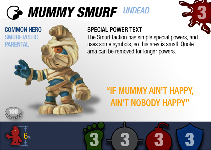   I also tried a different option for the bomb icon:  Finally, let's talk about points. Two of the possible locations are shown here (the coin on the left, text on the right):  but we could also put the points down in the lower right area of the blue bar. Here are a few options for that, including a (I guess) ruled-out piggy bank anyway just because I'm fond of it for some reason, at least for smurfs cards:    So, @dok , @TREK, @superfrog , @japes , @Soundwarp SG-1 , @jesus20456 , @mcmeeple , @Tornado , and everyone else, what do you think about the following issues: 1) raising the icons higher as shown 2) options for range icon 3) bomb icon options 4) options of where to put points icons What looks best? I'll hold off giving my opinions this time until I've heard from others. (I just realized that I forgot to flip the smurf head icon back the other direction, as the consensus seemed to be that it looked better facing the other way. That'll be fixed next time--I don't feel like redoing all of these draft images.) There is nothing more dangerous than sincere ignorance and conscientious stupidity. --MLK
|
|
#4
February 5th, 2017, 02:16 PM
|
||||
|
||||
|
Re: Smurf along with me: la la la-la la la!
Raising the icons looks great. I like both Dok's Arrow and the crosshair idea, particularly the second cross hair down looks the most like a cross hair. I like the point value icon on the right of the other icons, it flows well. Also, prefer the coin to the piggy bank. The original bomb icon you have looks better than the new one. I like how you have the stats on the left of the figure. The only thing I think would possibly be a problem is if you have a card that has enough power text that it would conflict with the quote. I find the flavor text fun but unneeded. Very cool indeed. Also is the size of the figure going to be listed under the other stats on the left or are you going to incorporate that into the hitzone?
Check out my ebay where you can find my custom dice trays and dicetowers: https://www.ebay.com/usr/captainamazing_jerdo
|
|
#5
February 5th, 2017, 02:31 PM
|
||||
|
||||
|
Re: Smurf along with me: la la la-la la la!
1. I think this location with the numbers bumped down a bit would look great.
Quote:
3. No preference on the bomb. Both look fine but I don't know how the new one would mesh with the raised icon approach. 4. I think the extreme bottom right location makes sense but I think that would mess with the flow of the raised icons. My next choice is the option shown in the image I quoted above. With an interest in the dead space between the size and the icons below the figure as an alternative not shown. Would I want it to be everything I love...sure...but that's just not realistic so I'm going to focus on finding things that will make me unhappy and work on fixing those.
|
|
#6
February 6th, 2017, 11:04 AM
|
||||
|
||||
|
Re: Smurf along with me: la la la-la la la!
I am loving your work on this. It feels smurftastic. Here is my 2 cents on all your variations.
Love the placement of the icons here (vertically speaking): Arrow icon for range makes me think to much of movement. And btw, the foot for movement is spot on for the Smurfs imho. For me, this range icon gives me the greatest indication that this is the distance I can attack: I prefer the original bomb. The one with sparks almost looks like a bubbling potion. (being super nit-picky here) For me, I most prefer the point cost in the coin as shown here. It doesn't say "points" which is kind of a bummer, but the coin implies payment, which is essentially what it is. Funny, I like the smurf head facing right, oh well, can't win them all My Custom Building Terrain Level Scape - Super simple RPG style character progression My TMNT Custom Units Laser etched replacement dice
|
|
#7
February 6th, 2017, 11:22 AM
|
||||
|
||||
|
Re: Smurf along with me: la la la-la la la!

|
|
#8
February 6th, 2017, 12:06 PM
|
||||
|
||||
|
Re: Smurf along with me: la la la-la la la!
I prefer the icons a bit lower - it's much better to center the numbers on the bottom bar and have the icons cut off on the bottom, IMO. I actually prefer the icons to not peek above the bar at all; I think it looks cleaner.
I like the arrow for range (shocking, I know!) but the second of the three crosshairs (the one mcmeeple liked) is pretty good too. I prefer the old bomb to the new bomb. Visually, I like the coin in the bottom right and MRAD centered the best. However, if that doesn't work well for squads with their multiple hitzones on the left side, then putting cost in the bottom left above the hitzone works fine too. (I'll also note that, for some odd human visual system reason, it's easier to read the white-on-silver points cost text when it's on the light background on the left than when it's on the dark background on the bottom bar.) I still think "common hero" makes the most sense as the thing next to the name, with species/class/personality on the left. Or all four on the left. EDIT: I guess that means I'm voting for this version, only with "Undead" moved to the left, and "Common Hero" possibly moving to Undead's former place. Last edited by dok; February 6th, 2017 at 05:24 PM.
|
|
#9
February 6th, 2017, 01:23 PM
|
||||
|
||||
|
Re: Smurf along with me: la la la-la la la!
Quote:
Would I want it to be everything I love...sure...but that's just not realistic so I'm going to focus on finding things that will make me unhappy and work on fixing those.
|
|
#10
February 6th, 2017, 04:55 PM
|
||||
|
||||
|
Re: Smurf along with me: la la la-la la la!
I, too, like the second crosshair, and the coin.
Having the icons overlap into the main area doesn't do much for me. I can't decide whether I like them pushed all the way right or more centered. I think the species would look better with the rest of the stats, and if you want something there, I agree that rarity would be the thing to put there. Original bomb  I still think armor or a helmet would be good to try. The top of the big toe is slightly cut off in all the pictures. Also, nice work on @Dad_Scaper 's online/offline symbol thing.
|
|
#11
February 6th, 2017, 06:59 PM
|
||||
|
||||
|
Re: Smurf along with me: la la la-la la la!
Quote:
>Also, nice work on @Dad_Scaper 's online/offline symbol thing.  Duty calls...I will respond to the replies from the past day later. Thanks again everyone! There is nothing more dangerous than sincere ignorance and conscientious stupidity. --MLK
|
|
#12
February 6th, 2017, 09:45 PM
|
||||
|
||||
|
Re: Smurf along with me: la la la-la la la!
Hey!!!
|
|
|
|||||||
|
|


 =
=


 Hybrid Mode