
|
|
|||||||
| C3G Legacy Library This is the archive for all the designs released in the original era of C3G. Feel free to post any figure specific questions in their individual books. |
 |
|
|
Thread Tools | Search this Thread | Display Modes |
|
#169
 October 16th, 2019, 06:17 PM
|
||||
|
||||
|
Re: The Book of Negative Man (VOTE for On Deck)
Seems like it’d be irresponsible to not at least try it.
C3G can be played with official Heroscape, but it's not recommended.
DISCLAIMER: C3G claims no ownership of the characters or artwork used for C3G customs. All rights for the characters belong to their respective publishers/creators. C3G cards are not intended for sale, and C3G does not authorize any party to profit from C3G cards.  
|
|
#171
October 16th, 2019, 07:24 PM
|
||||
|
||||
|
Re: The Book of Negative Man (VOTE for On Deck)
Testing out the negative idea, I like it, but I like weird crap so...
 <snip> I can work on a bandage version in a bit, this guy can get alt cards out the ass, but that one is going to take more work so it might be a while.  My Repaints and Mods: Updated 1-13 My Custom Cards: Updated 4-15 My Custom Superheroes: Updated 1-13 My figure images for online games: Alliance figures, Utgar figures My Etsy Store Last edited by tcglkn; April 21st, 2020 at 09:53 AM.
|
|
#172
October 16th, 2019, 07:33 PM
|
||||
|
||||
|
Re: The Book of Negative Man (VOTE for On Deck)
I like that as well, but I'm in the same camp of loving weird crap. It'll probably cost 2x the ink of a regular C3G card to print though.
|
|
#173
October 16th, 2019, 07:34 PM
|
||||
|
||||
|
Re: The Book of Negative Man (VOTE for On Deck)
Doesn't look bad. I do question whether we may be overdoing the custom cards? And with this new precedent of changing those areas, what that could lead to down the road.
Not saying no or anything, just making sure we're considering it.
|
|
#174
October 16th, 2019, 07:58 PM
|
||||
|
||||
|
Re: The Book of Negative Man (VOTE for On Deck)
Hmm, it's definitely interesting!
I could understand if it's a bridge too far for some folks, though. Might be better to just keep as the alt. C3G can be played with official Heroscape, but it's not recommended.
DISCLAIMER: C3G claims no ownership of the characters or artwork used for C3G customs. All rights for the characters belong to their respective publishers/creators. C3G cards are not intended for sale, and C3G does not authorize any party to profit from C3G cards.
|
|
#175
October 16th, 2019, 07:59 PM
|
||||
|
||||
|
Re: The Book of Negative Man (VOTE for On Deck)
Bats basically said exactly how I feel about it
|
|
#176
October 16th, 2019, 08:32 PM
|
||||
|
||||
|
Re: The Book of Negative Man (VOTE for On Deck)
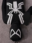
Yeah the black background on the power text looks too "customy" for me. I'm going hard no there.
I don't hate the black text for the rest, but don't love it either Would I want it to be everything I love...sure...but that's just not realistic so I'm going to focus on finding things that will make me unhappy and work on fixing those.
|
|
#177
October 16th, 2019, 09:24 PM
|
||||
|
||||
|
Re: The Book of Negative Man (VOTE for On Deck)
Ok, trying a bandage one as requested.
My Repaints and Mods: Updated 1-13 My Custom Cards: Updated 4-15 My Custom Superheroes: Updated 1-13 My figure images for online games: Alliance figures, Utgar figures My Etsy Store Last edited by tcglkn; April 21st, 2020 at 09:53 AM.
|
|
#179
October 16th, 2019, 10:20 PM
|
||||
|
||||
|
Re: The Book of Negative Man (VOTE for On Deck)
Tbh that's my least favorite of the bunch. The stripes don't read to bandages to me as much as they do dirt tracks, and the white border doesn't look nearly as good imo. It also loses a lot of cohension with Elasti-Girl.
I still probably like this version the most; <snip> Looks good to me, gives a subtle hint to him being "negative", but I bet 50% of players won't even notice it. It's also cool because since the Morrison era, his look has become black sunglasses over an off-white bandaged head (like the comic art). The art is mimicking the character here, and I think that's neat. Last edited by tcglkn; April 21st, 2020 at 09:54 AM.
|
|
#180
October 17th, 2019, 12:28 PM
|
||||
|
||||
|
Re: The Book of Negative Man (VOTE for On Deck)
The black text looks really off-putting. Definitely not a fan of the negative card. It's really hard on the eyes.
Reversing straight black and white is just harsh. Coming from a painting standpoint, you rarely ever use flat black and white. It's harsh and since they're extreme colors you can't adjust them. And we're goofing around with those colors on a card, so that's why it looks so weird. If the text was maybe a real dark red or something, it'd look better, but the flat black there just really clashes.
|
|
|
|||||||
|
|
 Similar Threads
|
||||
| Thread | Thread Starter | Forum | Replies | Last Post |
| The Book of Negative Spirit | MrNobody | C3G Legacy Library | 43 | February 10th, 2022 02:00 PM |
| Can't give Negative Reputation | Kinseth | HeroScape General Discussion | 14 | December 8th, 2011 12:30 PM |
| Negative Reputation and Heroscapers | Chilling Touch | HeroScape General Discussion | 42 | June 24th, 2010 04:47 PM |
| Negative Effects | Pattar007 | Official Units | 15 | December 6th, 2006 07:49 PM |


 Linear Mode
