
|
|
|||||||
| Comic Hero Custom Creations Any comic book customs and the discussions surrounding them |
 |
|
|
Thread Tools | Search this Thread | Display Modes |
|
#73
 February 23rd, 2017, 02:51 PM
|
||||
|
||||
|
Re: Smurf along with me: la la la-la la la!
Quote:
Check out my ebay where you can find my custom dice trays and dicetowers: https://www.ebay.com/usr/captainamazing_jerdo 
|
|
#74
February 23rd, 2017, 03:10 PM
|
||||
|
||||
|
Re: Smurf along with me: la la la-la la la!
Quote:
You may also want to give Amazo a try. He has a lot of powers so there are more line breaks. Would I want it to be everything I love...sure...but that's just not realistic so I'm going to focus on finding things that will make me unhappy and work on fixing those.
|
|
#75
February 23rd, 2017, 03:18 PM
|
||||
|
||||
|
Re: Smurf along with me: la la la-la la la!
Quote:
Would I want it to be everything I love...sure...but that's just not realistic so I'm going to focus on finding things that will make me unhappy and work on fixing those.
|
|
#76
February 23rd, 2017, 03:25 PM
|
||||
|
||||
|
Re: Smurf along with me: la la la-la la la!
Quote:
|
|
#77
February 23rd, 2017, 03:30 PM
|
||||
|
||||
|
Re: Smurf along with me: la la la-la la la!
Quote:
(And I still like the coin icon instead of "100 points", but I recognize that I could be wrong about that. I am less willing to admit wrongness on the abridged text thing. EDIT: random thought on the coin: what if it was in the spot it's in on the current draft, but the coin was cut off slightly on the left by the edge of the card, and significantly on the bottom by the bottom bar? So you still have a recognizable coin, but the area is more rectangular so there's less wasted space.
|
|
#78
February 23rd, 2017, 04:39 PM
|
|||||
|
|||||
|
Re: Smurf along with me: la la la-la la la!
Quote:
And given that, the question becomes if creating an abridged version has value, so do I bother with them. I believe it does. None of these reasons individually are a big deal, but I think they add up to a reasonable case. Skip spoiler if uninterested:
Spoiler Alert!
Quote:
Smaller font (5.55 points, same as official card), more spacing:  vs. bigger font (6.0 points), less spacing:  For full effect, you'd have to print both of those out as 3.5x2.5-inch images on a quality color printer, with quality paper (applying color correction if needed). I just did it (minus the color correction). I'd take the smaller text any day, but so far I don't have first-hand experience with presbyopia and can't speak to how it might affect legibility. Quote:
Quote:
-DR DOOM: 256 words, 1383 characters, 3 powers, 2 symbols -AMAZO: 194 words, 1112 characters, 5 powers, 2 symbols Yeah, I think AMAZO will turn out to be the harder of the two. I will probably have to start the special power text on the same line as its heading for each power, copying one of your solutions to the "lots 'o' text" problem. Even with that, I might have issues. I haven't directly compared, but suspect I've got quite a bit less of the surface area of the playing card devoted to power text than you. And mine is more horizontal which helps for fewer, longer powers, but hurts with a greater number of powers. I will give it a go. Quote:
There is nothing more dangerous than sincere ignorance and conscientious stupidity. --MLK
|
|
#79
February 23rd, 2017, 06:00 PM
|
||||
|
||||
|
Re: Smurf along with me: la la la-la la la!
Any chance you could shift the symbols on the bottom up so they just touch the line above them?
And no bridges please. A cloud can change its semblance, yet retain its will With the intimacy of destruction, One knows what it is to be alive The empty sky holds no reflection, for sorrow - Eslo Rudkey
|
|
#80
February 23rd, 2017, 06:06 PM
|
||||
|
||||
|
Re: Smurf along with me: la la la-la la la!
FWIW I agree it's the best place for cost. Worst case the points are overlaid over a figure image, whereas putting them bottom right gets in the way of longer power text.
|
|
#81
February 23rd, 2017, 06:30 PM
|
||||
|
||||
|
Re: Smurf along with me: la la la-la la la!
The most power text I've been made aware of so far for Valhalla-scape (Hasbro + C3V) is Augamo with his ~1050 characters of text. Because of that, I made the following test. (My Augamo is in Texas at the moment, and I had to use the C3V image as source, so that's why his left eye is a bit funny looking. I'll fix it when I can take my own image).
Is this text too cramped? (Text is 5.55 points high, same as official Repulsors card). 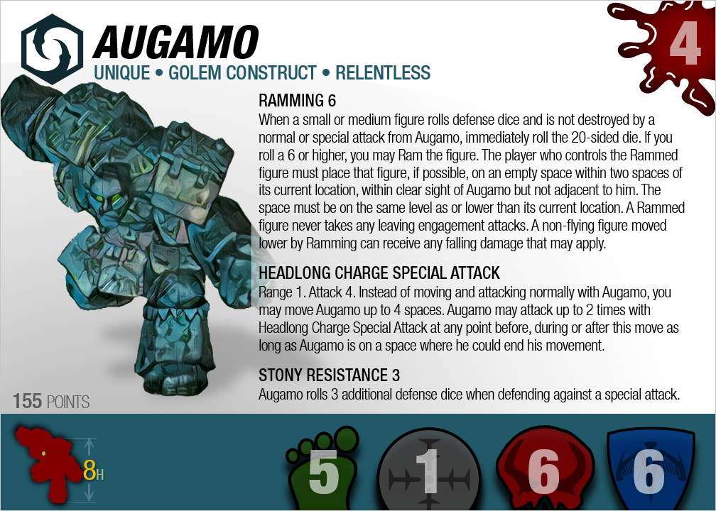 Assuming the above looks OK, we should be good to handle pretty much any card Valhalla-scape can throw at us with this template. --- Also, I'm still hoping to hear from others as to whether eliminating the headings on the back side of the card was a change for the better. (Ignore that unabridged cards won't have that top green section unless there is a Bio to slot in there. Removing that makes room for the big gold-colored quote to be added elsewhere on the back): Quote:
There is nothing more dangerous than sincere ignorance and conscientious stupidity. --MLK
|
|
#82
February 23rd, 2017, 07:01 PM
|
||||
|
||||
|
Re: Smurf along with me: la la la-la la la!
I gotta know what filter you are putting on the figure images. Is it photoshop or something similar?
EDIT: the text looks great. I think it fits in there fine. Check out my ebay where you can find my custom dice trays and dicetowers: https://www.ebay.com/usr/captainamazing_jerdo
|
|
#83
February 23rd, 2017, 07:31 PM
|
||||
|
||||
|
Re: Smurf along with me: la la la-la la la!
No complaints about the text for Augamo.
I mildly prefer headings for the text on the back but I don't feel strongly.
|
|
#84
February 23rd, 2017, 07:58 PM
|
||||
|
||||
|
Re: Smurf along with me: la la la-la la la!
Quote:
It may be too uniform for your look thought but just a thought. Would I want it to be everything I love...sure...but that's just not realistic so I'm going to focus on finding things that will make me unhappy and work on fixing those.
|


 Linear Mode
