
|
|
|||||||
| Maps & Scenarios Battlegrounds and scenarios |
 |
|
|
Thread Tools | Search this Thread | Display Modes |
|
#109
 June 5th, 2009, 08:32 PM
|
||||
|
||||
|
Re: LongHeroscaper's maps - GenConMap workstation (7 maps 05
I have changed TriPeaks a little bit to accommodate the Hive. I could not believe that I overlooked that. Here is the modified TriPeaks: (Building instruction is here)
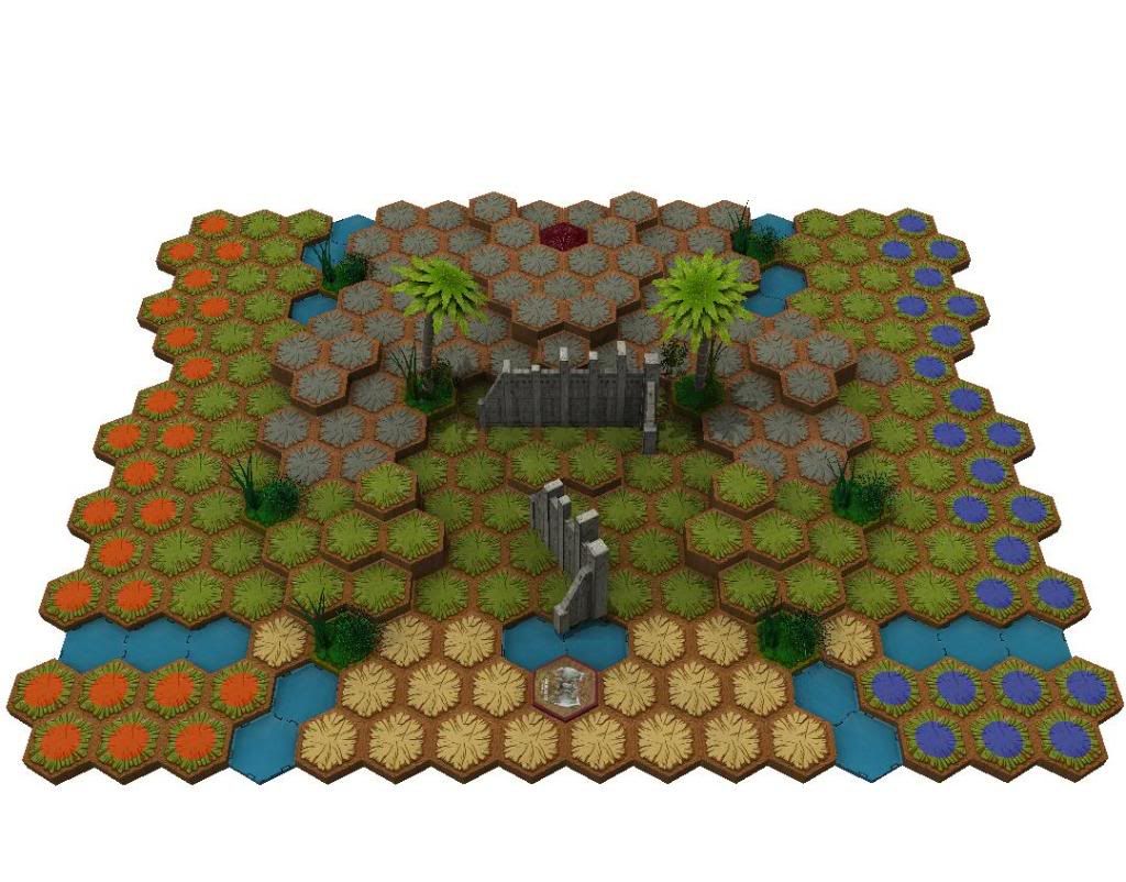 EDIT: Thanks GameBear for telling me that I still need to fix the starting zone for the Hive. I hope this version is fine now! L...o....n......g.....H...e.....r....o.....S....c....a....p...e......r ..... Heroscape Brief Card for Beginners. How to share your maps with the world. VirtualScape 101. My map thread. Last edited by LongHeroscaper; June 5th, 2009 at 11:02 PM. 
|
|
#110
June 21st, 2009, 07:44 PM
|
||||
|
||||
|
Re: LongHeroscaper's maps - GenConMap workstation (7 maps 05
I would love it if you could give us the build instructions to the rest of these maps!!!
I'm looking at using two of them in my Tournament! Cut(Th)road, and The Dead torch Spread Positivity and the joys of gaming.
|
|
#111
June 21st, 2009, 09:55 PM
|
||||
|
||||
|
Re: LongHeroscaper's maps - GenConMap workstation (5 maps 05
Quote:
I think this looks awesome! (the road section in the middle and the split starting zones in particular) I made one similar to it at first glance (didn't build in VS though, so you can't find it here. I had height on the sides, but I like it centralized much better!
|
|
#113
July 17th, 2009, 03:19 AM
|
||||
|
||||
|
Re: LongHeroscaper's maps - GenConMap workstation (7 maps 05
I had my tournament last Weekend, and made sure to ask about all maps that were played...
I used The Dead Torch, and Cut(th)road their, and from everything I gathered both were very well received. I had not personally got to play them that day, but had done the play testing for both of them before the tournament. 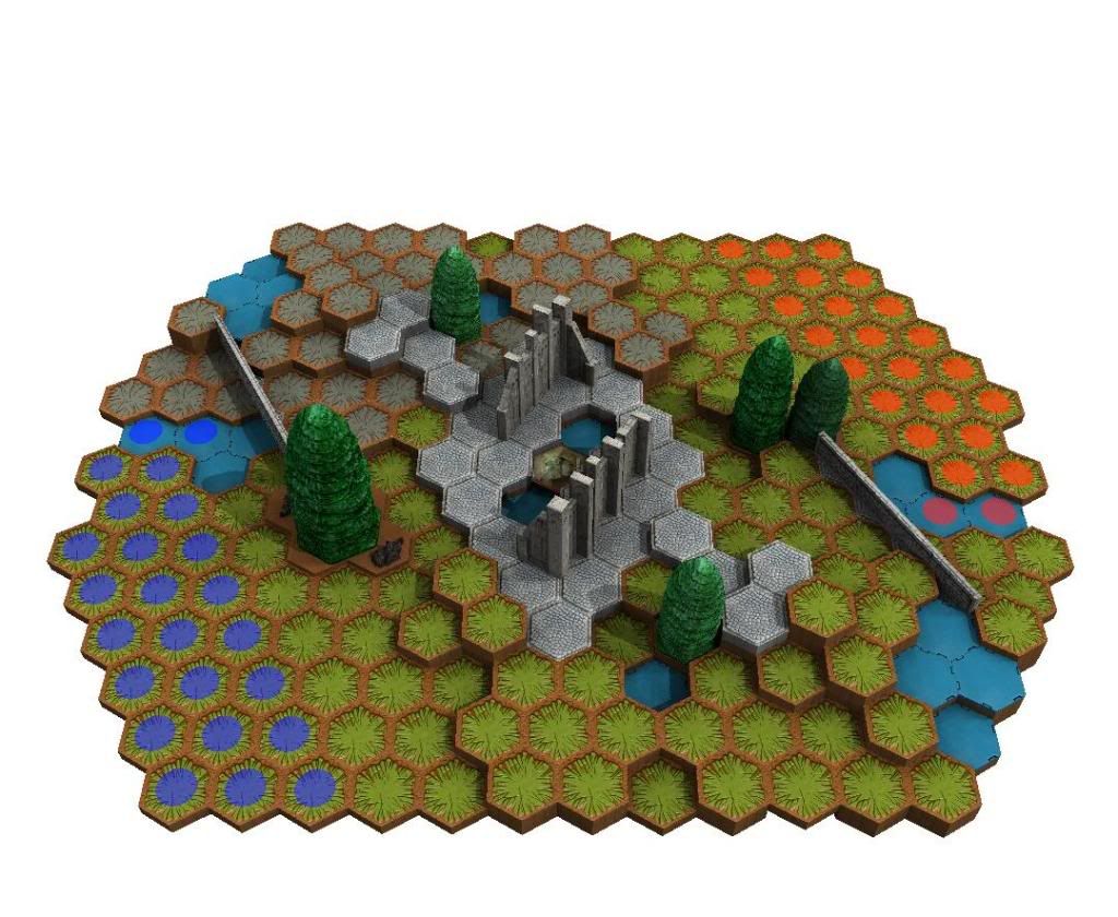 Cut(Th)road is a very interesting map, it offers Cliffs on the sides of the map, and a road down the middle much like Badru Valley does, but uses the road much less as a quick way across instead being a helper to slow moving melee squads catch up with range, and an impressive safe spot for them to camp from range... This is due to the clever Ruin placement, and some smart Terrain building. I'm not entirely sure if the Road Wall pieces are legal on Water, It works fine, so I'm happy with it. Those wall pieces do serve some purpose as they funnel almost everything toward the middle of the map, which is actually very neat IMO. Overall I really like the map, but want to get some more competitive games on it before completely giving if my judgment on if it's a great map. The next map again I never got a chance to play at the tournament but did play test it before hand. 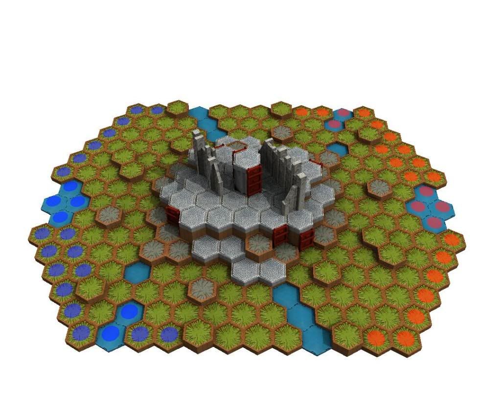 The Dead Torch doesn't look all that impressive from the image on the computer when downloaded, but in real life, it's quite a stunning map visually!(strangely enough) I originally thought the tower looked so lonely their all by it's self and would create a mad dash toward the center of the map for control over that area. Without glyphs I though that center "Island" of sorts would be hard to take originally but easy to keep... Strangely enough In the 3 games I saw, and the 2 I played, no one could actually "take" the "Island" Their were brief stints of control, but no one outright dominated on it! Now on to my two favorite part of this map... 1.The ruins. This map does it better than almost any other that I've seen in LoS blockage throughout the whole game. Because almost all the focus takes place on of near that "island" in the middle, the Ruins do a fantastic job at blocking all LOS Point of views, so no range squad can actually dominate the center. They create an Uphill Battle for one side, and a downward battle from the Top, which doesn't favor one side. Obviously the height does help, but without clean shots their isn't much the Hill controllers can do about the oncoming units. 2. The Single Hex heights layer throughout the map. I didn't think these would help Melee as much as they give help to any unit trying to ascend while opposing units try to descend the "island" This really helps to balance the map out, and focus all the attention on the center of the map... but not feeling forcefully done from a players point of view! I hope great things for this map as I continue to play test it.  because both maps are very good! because both maps are very good!I was looking for more pictures, but couldn't get them on the Computer yet, so look for some later... I was also looking at Despair Garden, and is very impressed at it's beauty, I may have to try that out when you post the link! Spread Positivity and the joys of gaming.
|
|
#114
July 19th, 2009, 02:08 PM
|
||||
|
||||
|
Re: LongHeroscaper's maps - GenConMap workstation (7 maps 05
S1R ART0R1US, I am glad that you like the map. I had been struggling with the concept for a while. I specifically wanted to have the wall connecting to swamp-water tiles, I think it looks cool
Angear, I like Hot Meal and Katsuno Land, too Shades, I really appreciate your review. It is the joy of our maps being looked at and played thoroughly that keeps us "cartographers" going. Thank you for play-testing many maps! I am so glad that you like the placement of the ruins in those maps. I remember when I first started to build maps. I basically threw the ruins away because I did not know what to do with them. I now of course appreciate them much more. I think if the SotM had 2 ruins as the RotV does, it would be much easier to work with. Besides the fact that the RotV has more tiles, the ruins are the reason why creating a single RotV map is easier than a single SotM map. The single column of The Dead Torch can be lowered. I built it on a single grass hex just to be sure that it definitely follows the rule book. However, the majority agrees that castle columns can be placed on the table. In that case, the column in The Dead Torch can be lowered so that the figures on the platform can have an easier access to the figure on top of the column. That would be better, wouldn't it? L...o....n......g.....H...e.....r....o.....S....c....a....p...e......r ..... Heroscape Brief Card for Beginners. How to share your maps with the world. VirtualScape 101. My map thread.
|
|
#115
July 19th, 2009, 03:25 PM
|
||||
|
||||
|
Re: LongHeroscaper's maps - GenConMap workstation (7 maps 05
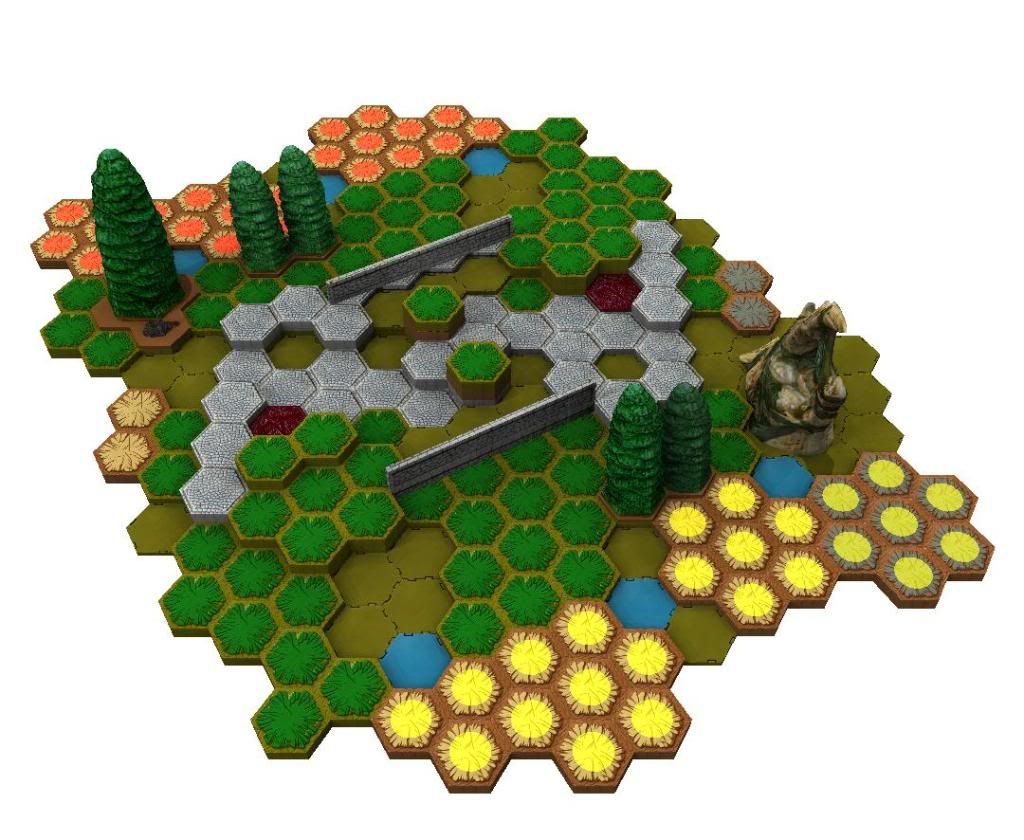
Apparently, I have never officially posted Hot Border here! Well, among the maps in my GenCon workstation, only Tripeak had been posted. I am freaking busy lately with work hence the lack of doing what I should have done a while ago. Anyway, here is the "official release"
Tripeak, requires 1RotV+1TJ Building instruction. I really like this map. It looks very good in person, and I think it plays well as well. There are actually quite a few options to deploy and advance your army. Hot Border, requires 1RotV+1VW Building instruction. 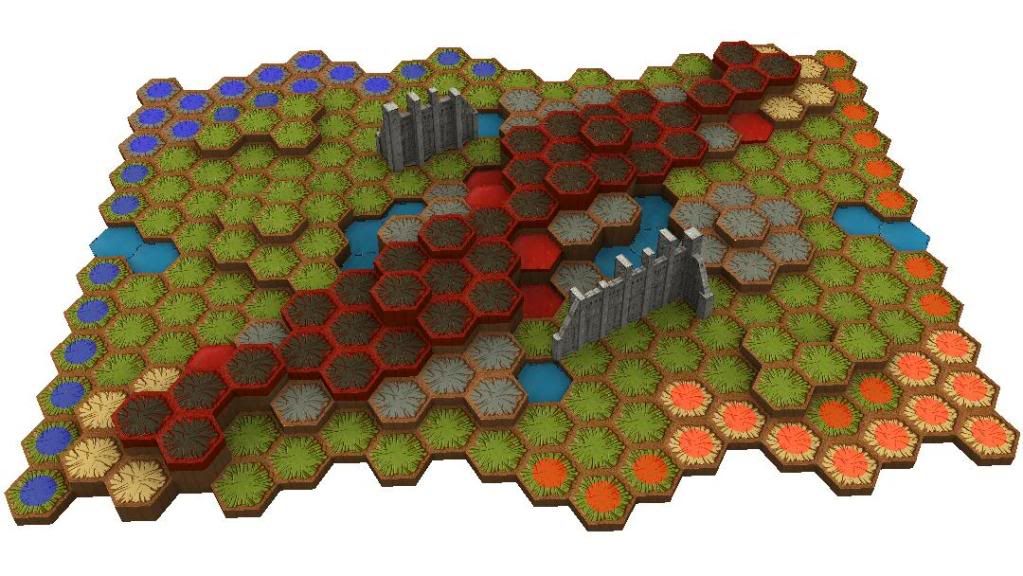 It's an experiment to bring the starting zones close to each other while avoiding first-turn domination. Cut(Th)road, requires 1RotV+1RttFF Building instruction. 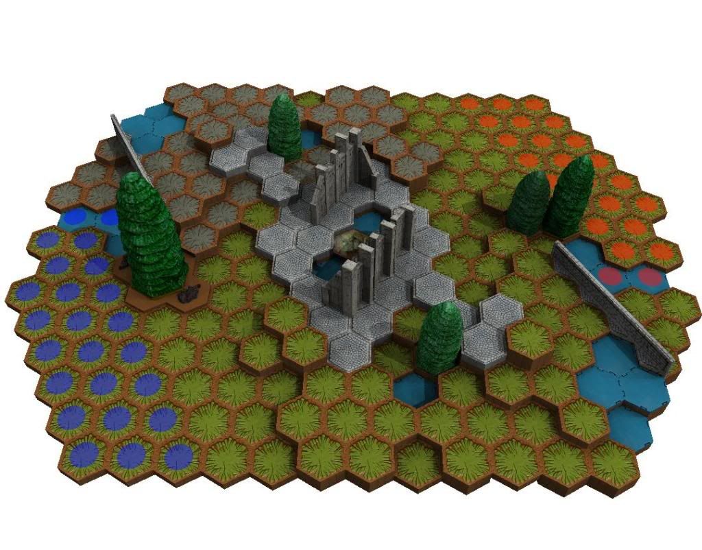 Master set 1 with Road&Trees is one of the most popular configuration, that is why it is hard to come up with something that has not been done before. I hope this map provides something new for you The Dead Torch, requires 1RotV+1FotA Building instruction.  The difficulty when building map with castle wall is the donimation of range units once they are on the wall's top. Not only that, non-flying, large figures usually complain when they can't attack a figure on the wall's top because the ground is too low. I think this map reduces those problems, and again you can see my trial of bringing the starting zone close to each other. As always, comments, good or bad, are very welcome L...o....n......g.....H...e.....r....o.....S....c....a....p...e......r ..... Heroscape Brief Card for Beginners. How to share your maps with the world. VirtualScape 101. My map thread.
|
|
#116
July 19th, 2009, 10:39 PM
|
||||
|
||||
|
Re: LongHeroscaper's maps - Updated (07/19)
I say the Center column on the Dead Torch is pretty low already, and that it shouldn't be lowered any more, but when I get some free time, I'll be sure to try it lowered, perhaps giving double spaces figures the chance to attack the unit on the column!
Spread Positivity and the joys of gaming.
|
|
#117
September 14th, 2009, 08:23 PM
|
||||
|
||||
|
Re: LongHeroscaper's maps - Updated (07/19)
You make awesome maps.
It is just that simple. -- James
|
|
#118
October 3rd, 2010, 10:27 PM
|
||||
|
||||
|
Re: LongHeroscaper's maps - Updated (07/19)
Wanted to drop you a line (when you return) -- we're using Wasaru Castle for Utah's National HeroScape Day. Realized that there are no start zones marked in the build instructions (not a problem), and that the sand side only has 23 hexes to rock's 24 (problem). I overlaid a 24-hex piece, and will add an unused single-sand hex to the front right corner, between the 7- and 2-hex tiles.
|
|
#119
July 3rd, 2014, 11:11 AM
|
||||
|
||||
|
Re: LongHeroscaper's maps - Updated (07/19)
I miss this!
L...o....n......g.....H...e.....r....o.....S....c....a....p...e......r ..... Heroscape Brief Card for Beginners. How to share your maps with the world. VirtualScape 101. My map thread.
|
|
#120
July 3rd, 2014, 11:18 AM
|
||||
|
||||
|
Re: LongHeroscaper's maps - Updated (07/19)
Quote:

|
|
|
|||||||
|
|


 Linear Mode
