Here's another probably-controversial idea I'm playing around with.
I'm really trying to keep the text readable, especially since I'm now old enough for progressive lenses. I love how C3G turned the Flying special power into an icon, and wondered if it would make sense to do that for a very small number of other powers that are (a) commonly used and (b) simple to understand and remember. Counter Strike, Disengage, stuff like that.
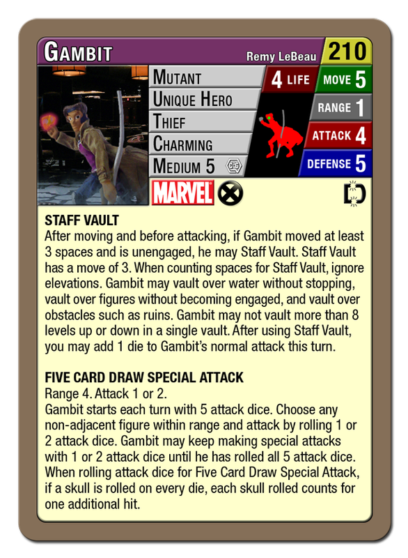
So I made a Disengage icon to see how I feel about it. This lets me increase Gambit's font size from 6.5 to 7, which may sound trivial but makes a difference to us old farts.

The one thing I don't like is that we would have to train ourselves to watch for the icon. Disengage isn't as intuitive as Flying, since most flying figures look like they fly in the picture. (
Most. I'm still trying to adjust to all the supers that fly in C3G but don't fly in the movies. Seeing Rogue floating in the clouds just seems so bizarre to me; my Triplicate Girl clix figures don't have wings or capes either. And boy am I weirded out by the conversation about
Drax flying!)
Anyway, this is just an experiment at the moment. My "real" Gambit file that's going to Printer's Studio has a normal Disengage text power instead.
Good traders: tdemirji, AbsintheAddict, Blubberguy22, Toa Matoro, SuperSamyon, Bl1ndsn1per, Ericth74,
Clipper423, Oh Freek, Nikkomon, DarthBaggins, quizzcode, Astroking112
& more on my
trade list