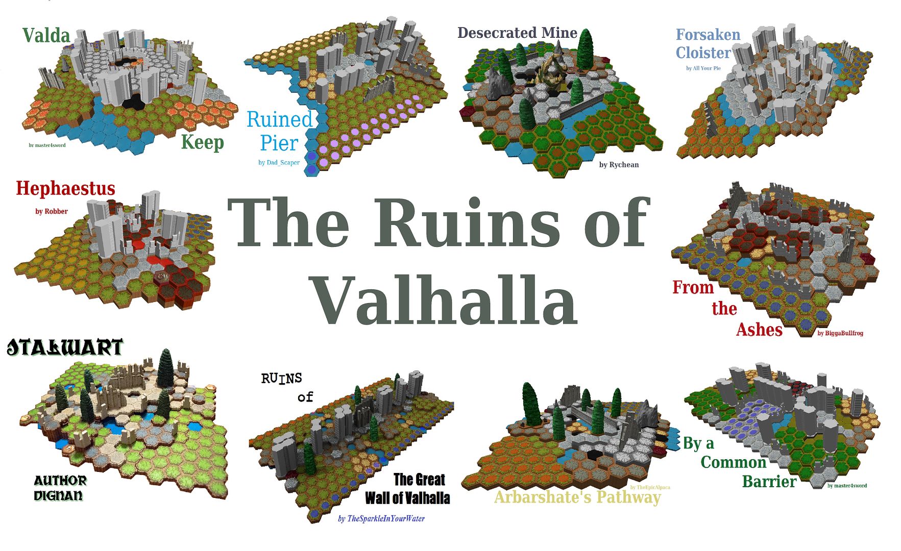
Sir Heroscape's Review:
Again, this was used in my subscriber tournament. Games on this map were awesome! Very pleased with this map. The split startzones i originally thought would be an issue, but it's very well done. The conflict starts turn one over the move glyph to see who can get their army in on the action faster. The startzones near the 7-hex height looks like a potential problem, but even when ranged figures took position, it wasn't very hard to engage with figures from the main startzone that's nearby and can use ruins to hide behind on the way to engage the opponent on height. The startzones are also close enough to the center "Keep" so that armies are engaging with their main forces by turn 2 and 3 of the first round. This lended to some very exciting games, and some strategic moves. The whole map was used, and the low glyph made it tricky to fight for b/c of the engagements from troops coming in and attacking over the central battlements. The only downside to this map is that it is very large and takes up a lot of space, but like i said, during my games on it, the whole map was used, and I was very pleased with its playability.
Tournament worthy?
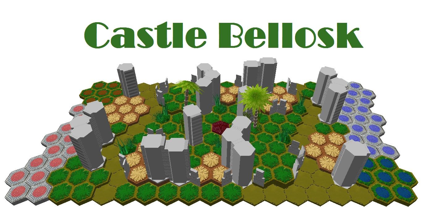
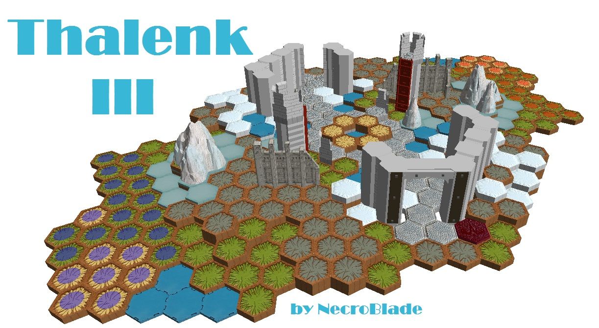
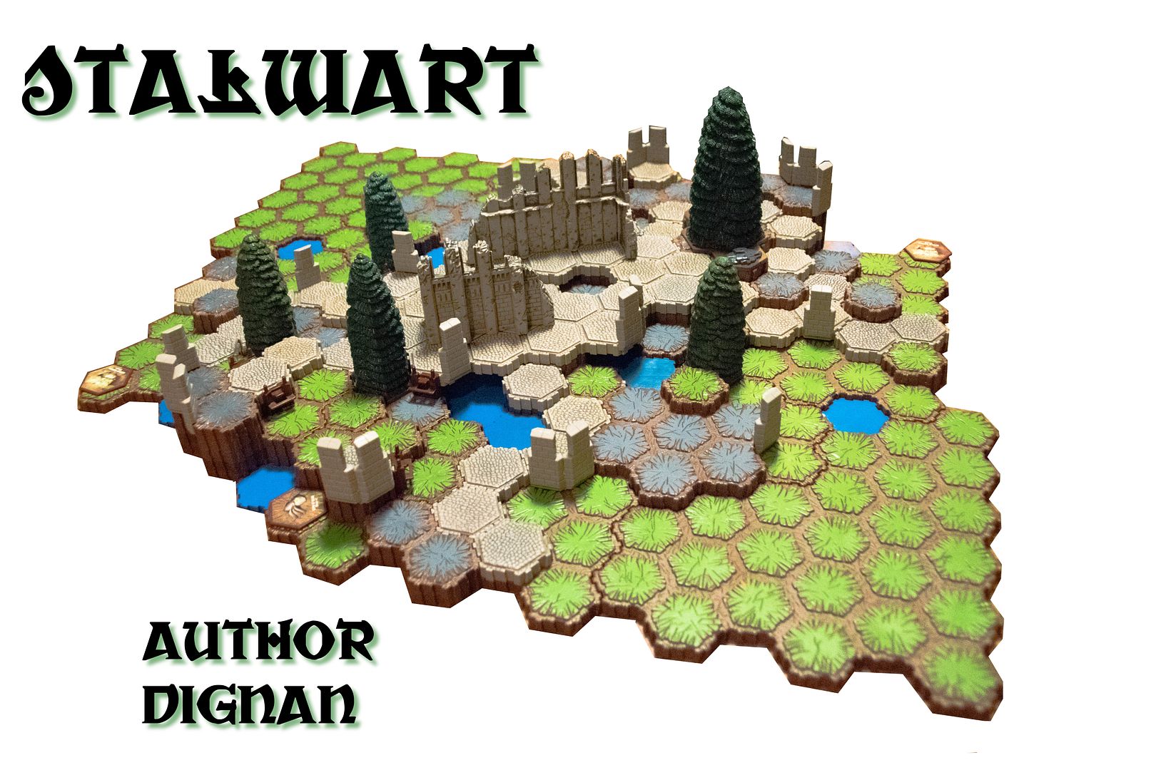
Stalwart
Spoiler Alert!
Sir Heroscape's Review:
This map was so-so. Players felt it was generally a good map, but there were some who felt it not ready for tournament play. It received partial marks in most categories, never really excelling. One concern I have (and that was voiced by others) is that there are 4 power glyphs on the map. That element alone causes me to turn away from it's tournament readiness because of the effect that has on gameplay. Competitive maps can use up to 3 power glyphs (if designed appropriately), but any more than that is too much. The position of the glyphs (2 on each opponents side) also lends to a my-half your-half mentality. Glyph placement needs to be reworked in my opinion on this map if it is to be ready for competitive play.
Tournament worthy?
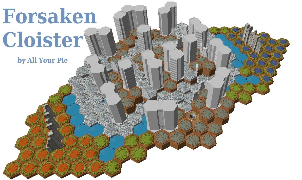
Forsaken Cloister
Spoiler Alert!
Sir Heroscape's Review:
I played on this map during my subscriber tournament. I played multiple times and with a large variety of armies. Aesthetically this map is pleasing. It looks really cool, and is very well designed for it's purpose in the contest. As a competitive tournament map though? It is lacking. Before the games I played started, I anticipated that the majority of conflict would be the one defense glyph near the low road. I was very right. EVERY game (as much as I tried and wanted to use the rest of the map) was clogged along the low road near the glyph. In a matchup, you want to reach your enemy fast, gain the advantage and push through their lines. Even though the high ground could allow flanking and height, it takes too long to develop troops (even with the road) and it's more worth it to try and take control of the defense glyph and push forward than to move up on the high ground. Even when I did attempt to develop my army through the height, I was drawn back to the low road and the conflict over the glyph. This map was not fully used and bottlenecks way too much along the low ground. There is really only one thing that I feel needs changing: Add a glyph on the high ground, opposite of the low ground glyph. I know, I can't believe I'm saying to put a glyph on high ground. BUT I think this map is an exception. Even though it would be technically elevated, the high ground is very flat...thus when being attacked, the glyph holder would not likely have a height advantage. The reason I offer this change is because there's no motivation to move up through the high ground other than to get height, and that's no enough for this map. With a glyph up there though, you'd pull the conflict both ways and motivate players to seek control of the high flatland even if it took some time to develop the troops. If that were the one change, I think this map would be much more ready for competitive play.
Tournament worthy?
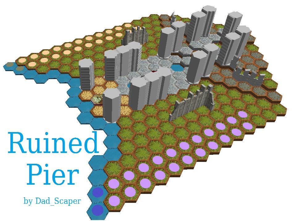
Ruined Pier
Spoiler Alert!
Sir Heroscape's Review:
Games were fun and exciting. Army development was quick and the use of strategy on this map is very apparent: run in the middle for the glyphs and rush your opponent, or take your time developing up the hill to hold the position (but give up the glyphs). The only two concerns I have with this map are mostly practical ones: 1) there are 23 required water hexes on this map and the RotV set only has 21. I suggest the simple fix to this would be to take off the last water hex on each end of the startzone to meet the maximum of 21 water hexes. 2) The battlements placed on the hill restrict too much development to the top. I was demotivated to develop my army on height when there was only 1 hex to go through on my way up. I think this is a simple fix as well, I think only the last battlement (closest to the startzone) needs to be removed. This allows the development up the hill to involve 2 hexes rather than bottlenecking on one. This also helps armies with double spaced figures to have an easier time of getting up the hill..whereas in it's current state, double spaced figures have a really hard time. I'd still recommend for tournament play because it wasn't too unbalanced, but I feel those changes would be necessary for higher level competitive play.
Tournament worthy? TREX's Review:
After building it, I had to sit back and just take a look. Just from first glance it does resemble a pier that has crumbled down in the middle. The way it is presented with the water line on the one side , and on the other the gradual climb up on the other side suggests where the tide would roll in and out. In other words, I thought it was great. When I started to play on the map I noticed how you really play on the entire map. All of it gets used. You get in the thick of battle rather quickly. Generally the first units that are started closer to the higher elevation, they run up and meet in the middle at the back of the pier. But as the game goes on, it is easier to just run through the damaged pier towards the enemy and draw what figures are left at the top down into the fray. This map seems to be very balanced and fun to play on. There are quite a few areas that non ranged figures can hide. Overall I found it to be very enjoyable and very fun to look at in its simple yet elegant design. Thanks again for this one Dad Scaper. I'll give my feedback on all these maps as I get a chance to play on them. My wife keeps me taking down the game table more often than I'd like.
Tournament worthy? Tiranx's Review:
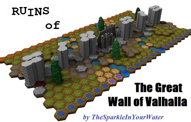
The Ruins of the Great Wall of Valhalla
Spoiler Alert!
Sir Heroscape's Review:
Easily the most Aesthetic map of the lot in my opinion, just looks so cool. The map does have some issues though. It is simply too large, for more reasons than one: 1) for practical purposes, it takes up too much table space (which as you Tournament Directors know, can be a legitimate issue in a busy and crowded gamestore), 2) Though the army is spread out along single hexes, it's likely that as the game progresses, you will try to keep your army together rather than spread it out for map control. The size is better suited for a 2v2 or huge 1v1 battle. Glyph placement: poor. Although the central glyphs aren't too bad, the edge glyphs just will not do. They can be reached in one movement and are well protected at the edge and behind castle walls...to easy to hold and too hard to get to for the opponent. The channels from one side to another aren't a terrible issue, but could potentially be choke points when an army of rats or other screen heavy army comes to play. It does lend itself to some faster play because it's so flat which is nice, but does lack dynamic as far as elevation goes. While aesthetically this is the best of the bunch (in my opinion), but collectively as the judges we feel it is not good for tournament play.
Tournament worthy? TREX's Review:
First off, building this one was very simple and straightforward. Very easy to set up. This is a huge plus for tournament settings. Next, this is quite a big map. I didn't realize how big it actually is until I put it up on the table. Regardless of its size, how the start zones are set up, you still get to use the majority of the map. Looking at it, it looks so cool. It looks just like it was intended too and has the feel of a breached wall. Made me think a little about Helms deep in Lord of the Rings: the two towers. How the map is set up, the figures are able to get into battle quickly within just a turn or two. There are some strategic choices to be had on this battle field. If you rush up too quick you set yourself up to get shot at. I found in a handful of games, when you rush forward too quickly it allows the enemy figures to either take a bunch of pot shots on you or charge up on you melee wise. But that also leaves them vulnerable the next turn. Your figures may want to run up to hide behind a chunk of wall before charging in the next turn. There aren't any super important parts of this map. There isn't any high ground to rush to and take to wipe out your enemies, it takes a bit of a different strategy on this one. I found this map to be very fun to look at, very practical in building skill level required. It's a hair bigger than what I'm used to playing on for tournament use, but has enough strategic use to be viable and fun. Thanks again sparkleinyourwater for your submission. Whoever throws their suggestion at me first for the next map I review from the contest I will run it next. Let me know by tonight, or I'll just do another from the list.
Tournament worthy?
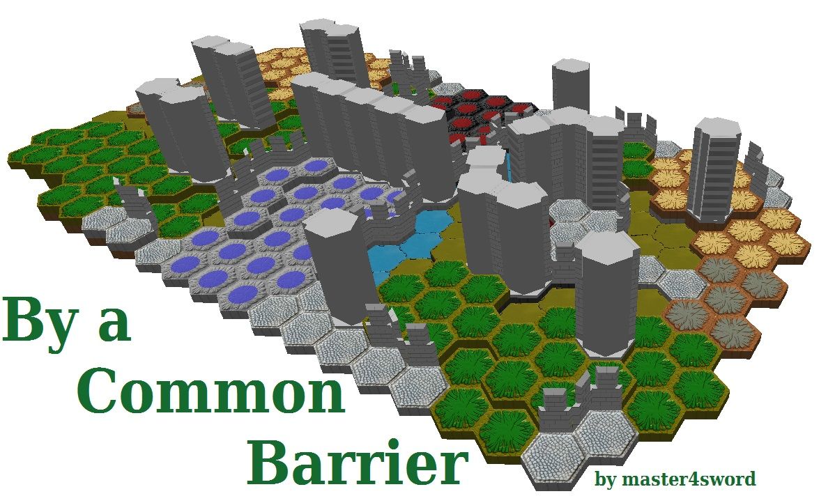
By a Common Barrier
Spoiler Alert!
Sir Heroscape's Review:
This map was also played on in my subscriber tournament. The one thing we judges liked about this map was that it looked fun and it defied the "cookie cutter" map design. But sometimes when you go out on a limb, the branch breaks. In this case it broke pretty hard. This map is not a tournament worthy map for 4 very fundamental reasons. 1) the glyph in the castle section has height when melee attackers try to engage. It's an easy choke point to defend, and takes too long for opponents figures to go around the back to try and get a height attack.
2) The entire map has difficulty being used. Even though glyphs are out, your opponent is very close and often you would rather get in an extra attack then try and send a figure off to take or fight for a glyph. I often ignored the glyphs just to get extra attacks on my opponent, therefore the conflict stayed very central rather than using the whole map.
3) 4 height figures cannot engage while in the water when next to the battlement of the opponent startzone. Similar to Ruins, both figures must be higher than a castle battlement in order to be engaged. Figures with 4 height are not (according to the rules) engaged when attempting to attack an opponents startzone.
4) More than any of the other points, this is the deal breaker...hands down. Dragons can see over the uncapped castle pillars into the opponents startzone. For this reason the map is broken and cannot be used competitively. Any dragon army can surround it's dragon for protection while the dragon has clear vision into the opponents startzone over the pillars and use special attacks to decimate the forces starting turn 1 of any game. For the others reasons and mainly this one, this map cannot be used in tournament play.
Tournament worthy?
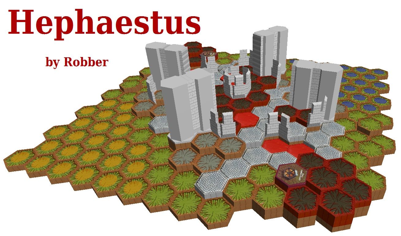
Hephaestus
Spoiler Alert!
Sir Heroscape's Review:
I had the opportunity to play on this map twice during the tournament. Aesthetically, looks very cool, especially with the cleverly designed LOS blocker in the middle with the battlements. It's a pretty good sized map, so army development doesn't take too long and elevation isn't too difficult to move through. I also liked that the whole map was used during play. BUT there are some fundamental issues. I feel that glyphs need to be very carefully placed for competitive maps, and glyphs on lava field in my opinion is a "no". Granted the BoV approved a map with glyphs on lava, but it has been my experience that glyphs on lava take away from a game more than give to it. BiggaBullfrog did manage to operate the glyph on lava using his Glad/Blast build pretty easily going on turn 1 and 2, off turn 3. But for most armies, that will not be worth the risk (depending on the glyph as well). Besides being on lava, the glyph position also has height with little opportunity for attackers to get above and attack down on glyph holders. Glyphs on height is a major issue for me (All of us judges included) on a tournament map. Another issue brought forth by
@Tiranx
was the open placement of molten lava tiles near the center of the map near the road. While map judges were overall not too fond of giving this a tournament worthy stamp, this map did receive high marks by other players for its playability. From our perspective though, there seem to be some issues with the map that need to be adjusted before it's ready for tournament play.
Tournament worthy?
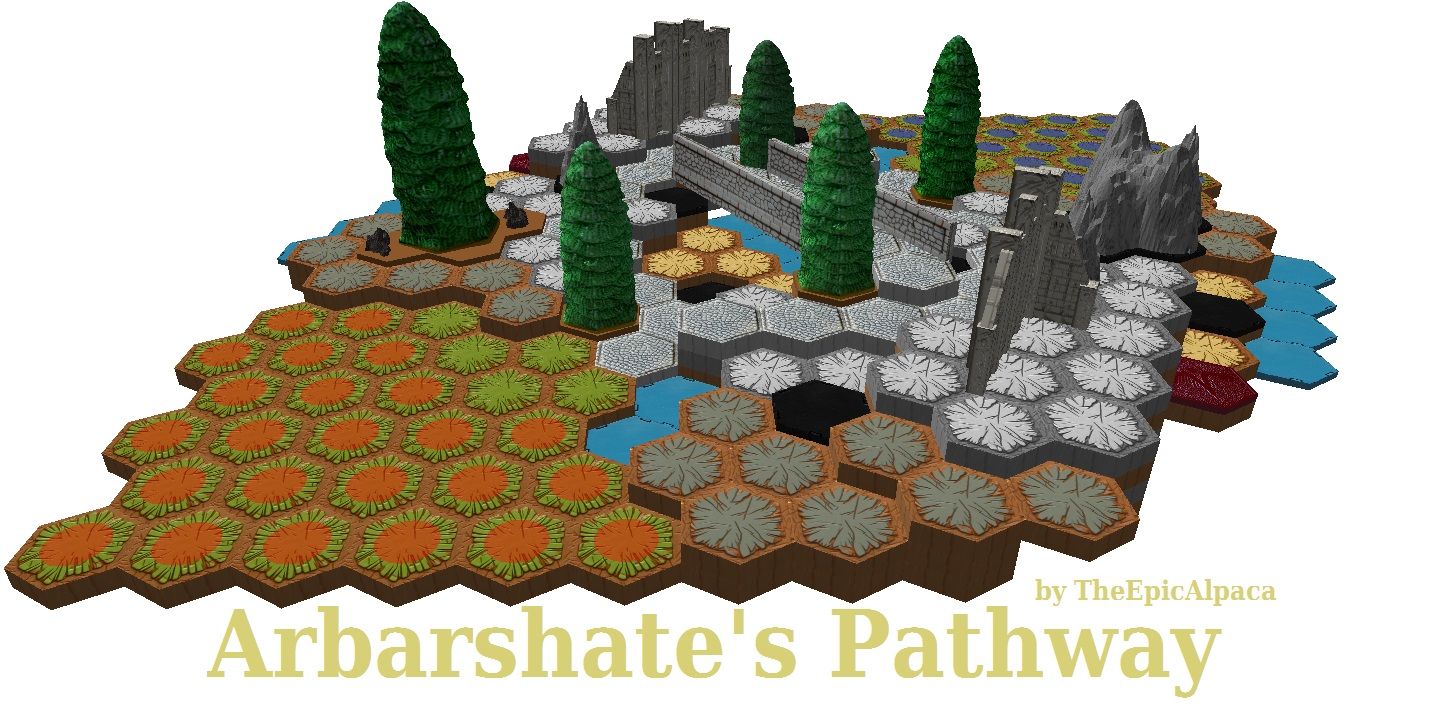
Arbarshate's Pathway
Spoiler Alert!
Sir Heroscape's Review:
Really like this map. Aesthetically pleasing and overall looks very balanced in elevation, size and open area and also has enough LOS blockers. Glyph placement is well balanced and takes 2 activations to reach - for just about every figure. During gameplay, the full map was used and game flowed well with little bottlenecking. Though this map could be prone to some of that near the bridge/ruin area. This creates a bit of a clogging effect, but didn't last too long b/c figures could move around the other side of the ruin or use the bridge. This map isn't too strong for ranged - and that's okay. To gain elevation for a ranged figure one has to move centrally, near the glyphs, or on the bridge which puts you a little too close for comfort...but that helps even the playing field. The roads are well placed and really get all the figures involved. Close to the start zone, they really help the development of the army, and games were faster paced and armies were clashing within the first round by turn 2 and 3. I like that about the map. Glyphs could be a little bit of an issue just b/c they're on the very edge and can be somewhat protected if you place your figures right, especially for pod armies. But, glyph control for the most part during my games was never a huge issue, but could be if people "played their cards right". Overall, great map. Very please with the gameplay, well balanced and fun to play on. Aesthetically looks great and I think would make for a good tournament map.
Tournament Worthy?
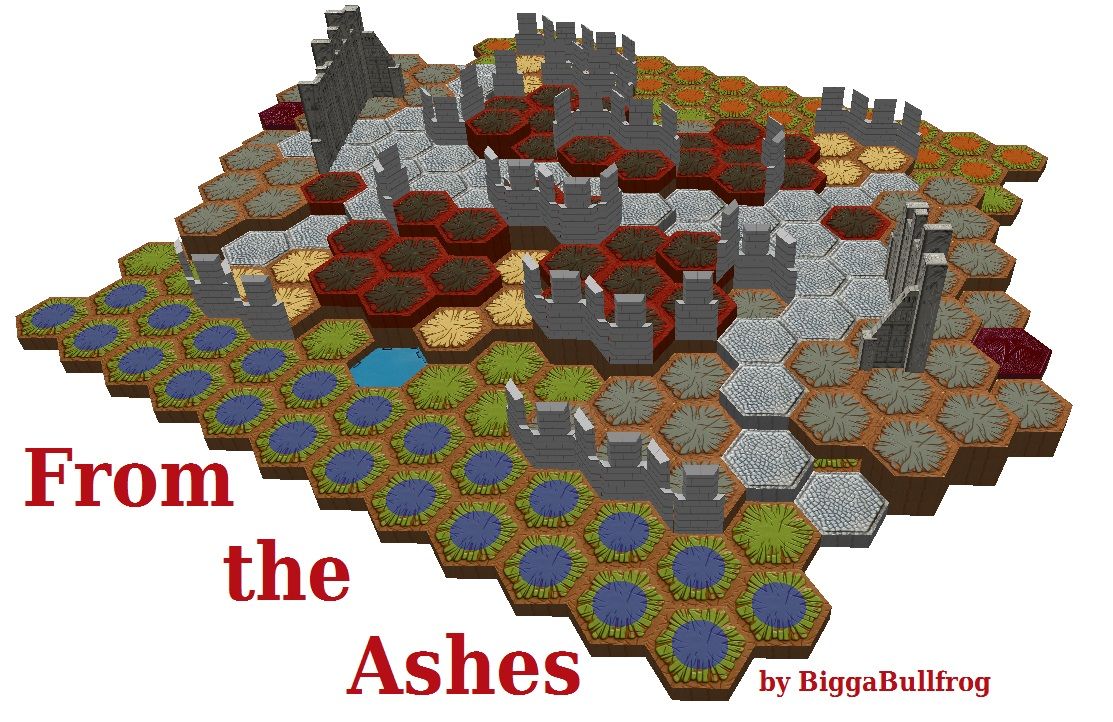
From the Ashes
Spoiler Alert!
Sir Heroscape's Review:
Very impressed with this maps design. The lava is wonderful! It is placed well enough that it doesn't hinder army development, but rather makes for some very strategic moves and decisions when looking for height advantages or safety behind battlements. It was never a game-changer like sometimes lava is, and really made the map fun. Glyphs were well placed midmap and on lower elevation. The only downside to the glyphs is the ease by which flying figures can reach them...but that's always a struggle to meet that qualification...and for the majority of armies that do not have flying, it still took two activations to reach. Battles used the whole map and conflict happened quickly. I can now fully suggest this as a tournament worthy map.
Tournament Worthy?
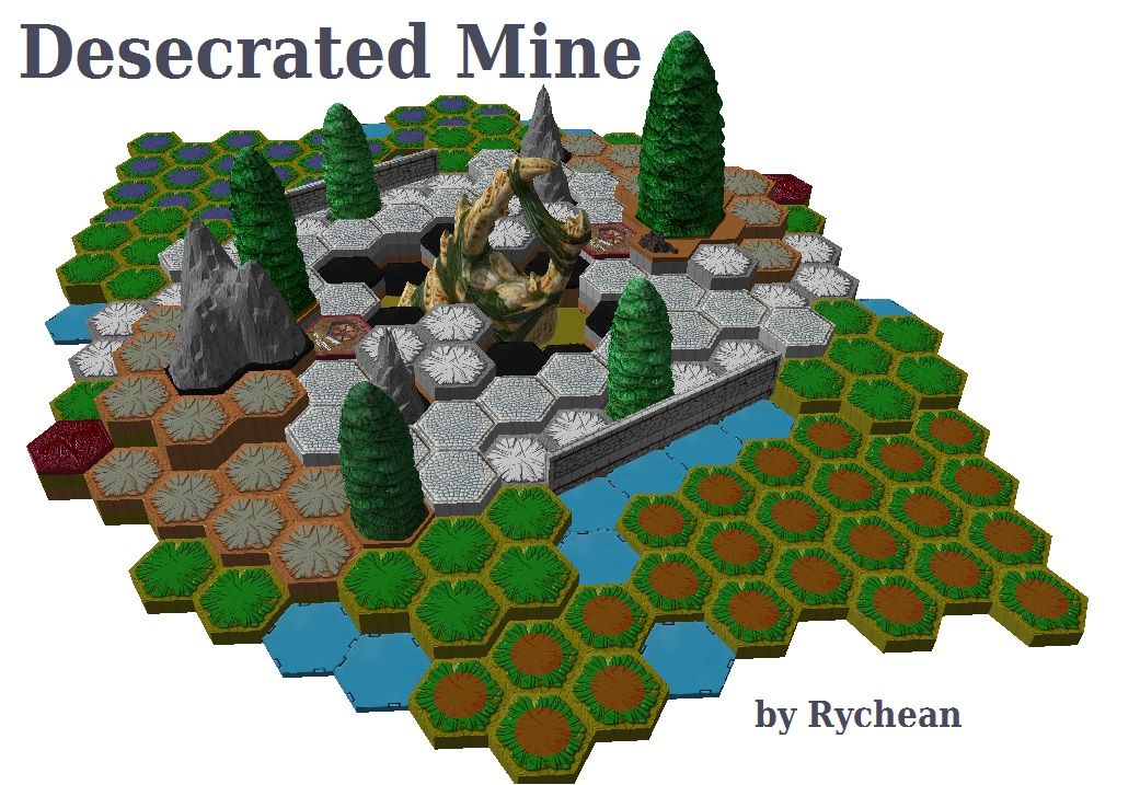
Desecrated Mine
Spoiler Alert!
[b]Sir Heroscape's Review:[b]
Legit map. Great backstory, great look, great play. Very well balanced at first glance and playtesting proved that as well. Glyphs are well placed 2 turns away from the majority of figures. LOS blockers are well placed. and good variety of elevation. Overall, the whole map was used, and every aspect seemed to come into play. The only beef I have is that I tended to start all my games on the right side where the 24hex is positioned in the startzone. It's a little easier to develop the majority of my army from that side and so I tended to move troops up through that way before then spreading the map. Maybe that's just me, but that's maybe one minor flaw I saw. The Roadways could potentially lend themselves to become major choke points as it will only take 2-3 rats or other lock-down units to block the way, so that's a concern...but it seems to be well enough offset by the high ground option around the tree and near the glyph. Games flow well.
Tournament worthy?
Derelict Ramparts
Spoiler Alert!
Sir Heroscape's Review
Aesthetically okay. Probably a little too many ramparts scattered about, but not too bad. There were a couple of lone shadow tiles placed in the middle of 7-hexers which seemed a little odd, but not too terrible. Flow is good on this map. Though LOS blockers are not present (besides the hive, and I guess some battlements) The movement isn't too restricted through the map. High ground is central and quickly enough accessible, not allowing too great of an advantage for heavier ranged armies. Startzones provide many different options to develop an army and that is very pleasing, and the map is all used. For the Hive being the sole, main LOS blocker it's actually placed quite well and provides enough cover for advancing melee armies up the middle of the relatively flat central portion of the map. I'm pleased with this map...and though I'm not 100% on giving it a "yes" for tournament playability at this point, I wouldn't mind seeing it at a tournament again.
Contest Details
Spoiler Alert!
Winner Announced
Spoiler Alert!
The Winner!!! Download
Congratulations
@TheSparkleInYourWater
!! Please PM
@TREX
your address so we can mail the dice tower prize out to you. OM's will be mailed soon as well for those receiving them.
What a great contest everyone. Thank you all for your participation and time. This contest has been such a success and it's all because of you guys. We're
glad you all took this to heart and really put in your best effort. These maps I think will become a collection worthy of tournaments and this won't be the last time you see them. We'll be giving battle reports and reviews on these maps after the tournament and as we play test them, so stay tuned. Again, thank you...this contest is for YOU the Heroscape community!!
Original Contest Post
Alright everyone, it’s time to dust off your VirtualScape program and start building! We’re calling on all map builders to come up with competative tournament worthy maps and to submit them here for scoring. In the end, 10 maps will be chosen and used in our Ruins of Valhalla themed NHSD tournament, and of the 10, #1 will be given a very high quality prize…that is: one of TREX’s very own handmade dice towers…for an idea of what he can do…check out his links here (1 , 2 , 3)
Why are we doing this?
NHSD is just around the corner and we wanted to use ALL non-BoV maps for the tournament…and why not get some newer maps “hot off the press” from the community!
Entries will be due @11:59pm MST on September 20th, 2016
Guidelines
Maps must be submitted with build instructions in either VirtualScape or PDF format and have at least one VirtualScape image or photo as well.
Maps may be either symmetrical or asymmetrical
Maps should have no more than 1 master set & 2 *expansion sets for build requirements.
Maps must be modeled after the theme: Ruins of Valhalla
You may make a maximum of 2 entries, and it must be your own work. All maps must be NEW, in other words…you made it for this event.
If you are submitting 2 map entries than each entry must use a different master set and nor more than one of the same expansion as your other map entry (i.e. if map entry #1 has TT and RttFF, than map entry #2 may only reuse one of those two expansions along with any other expansion)
OPTIONAL: Add a backstory as you submit the map, help us envision being there. A small prize will be awarded.
*Marvel and BftU will be considered as expansions in this contest.
Scoring
ALL maps submitted will be revised and scored according to the following Rubric:
Creativity (originality of build): 10pts
Balanced (doesn't favor one build over another): 10pts
*Each map will have 3 rubrics filled out, one from each judge. Those 3 scores will then be averaged for one final score for that map.
*At the end of the deadline, the top 10 maps will be chosen and posted. A PUBLIC POLL will then be opened for the community to vote on the best map out of the top 10. The map winner will be posted after a week long poll and the prize awarded. All 10 maps will be used in the NHSD Tournament.
Exactly what I was thinking in the OP @Sir Heroscape. To the contestants, I have settled on what kind of tower it will be. It will be a Weathered Castle Dice Tower in lieu with the Theme of the map build. You will love it.
EDIT: Also, I would add to the OP on the Balanced Requirement that it must be symmetrical or asymmetrical in balance.
A cloud can change its semblance, yet retain its will
With the intimacy of destruction, One knows what it is to be alive
The empty sky holds no reflection, for sorrow - Eslo Rudkey
All Power and Treasure Glyphs may be used regardless of the sets used for the map?
EDIT: Oh hell no. Too much competition, I am out.
A cloud can change its semblance, yet retain its will
With the intimacy of destruction, One knows what it is to be alive
The empty sky holds no reflection, for sorrow - Eslo Rudkey
That's a bit of an oddball, tagging me in a list of mapmakers. That said, I have been considering entering this contest regardless of my limited ability (and total lack of knowledge on where my virtualScape files are stored on my computer, heh).
Can we assume BoV requirements on areas where none are listed? For instance, is use of uncapped pillars allowed in this contest?
That's a bit of an oddball, tagging me in a list of mapmakers. That said, I have been considering entering this contest regardless of my limits ability (and total lack of knowledge on where my virtualScape files are stored on my computer, heh).
Can we assume BoV requirements on areas where none are listed? For instance, is use of uncapped pillars allowed in this contest?
I have no problem with uncapped pillars. As for
@TREX
and
@Sir Heroscape
, I'm not sure.
Uncapped castle walls are a great LOS blocker while keeping ranged flyers at bay. I think they are great for making maps and have done so with many of mine.


 August 29th, 2016, 11:48 AM

 Similar Threads


 Linear Mode
