
|
|
|||||||
| Comic Hero Custom Creations Any comic book customs and the discussions surrounding them |
 |
|
|
Thread Tools | Search this Thread | Display Modes |
|
#49
 February 18th, 2017, 11:49 PM
|
||||
|
||||
|
Re: Smurf along with me: la la la-la la la!
I'll say it in this thread too. Simply epic. I can't wait til you make some blanks we can get hold of and make customs with these bad boys. I wouldn't mind making a whole new set of cards with these.....and that's a lot of cards.
Check out my ebay where you can find my custom dice trays and dicetowers: https://www.ebay.com/usr/captainamazing_jerdo 
|
|
#50
February 19th, 2017, 08:35 AM
|
|||
|
|||
|
Re: Smurf along with me: la la la-la la la!
Quote:
Can I suggest you add the General's name to the back of the card/ After planet? You already have the Ullar design on the front. Personally I would remove the ranking, because they have been know to change (unless you are not adding customs and staying strictly within cannon) but the competitive info is great Watch out for the characters with more synergies, that could really mess with the font on the back. I like the coins but think the number is probably the better way to go (unless you really want to get intricate and put smaller coins for different denominations - that might look to bulky). remember, points are only really used at the start (or ending) of a game, so during game-play an icon may get in the way. If using the coins, try between height and movement. I think the non-centered look of icons draw your eyes faster to them. I'd love a Smurfy set when you're done! Good trades with - Porkins / xraine69 / mac122 (x2) / frylock / Ztimster (x2) and probably others I forgotten to mention...sorry. Last edited by AMIS; February 19th, 2017 at 08:39 AM. Reason: And yes the Icon border improves the smurfiness of the card.
|
|
#51
February 19th, 2017, 11:50 AM
|
||||
|
||||
|
Re: Smurf along with me: la la la-la la la!
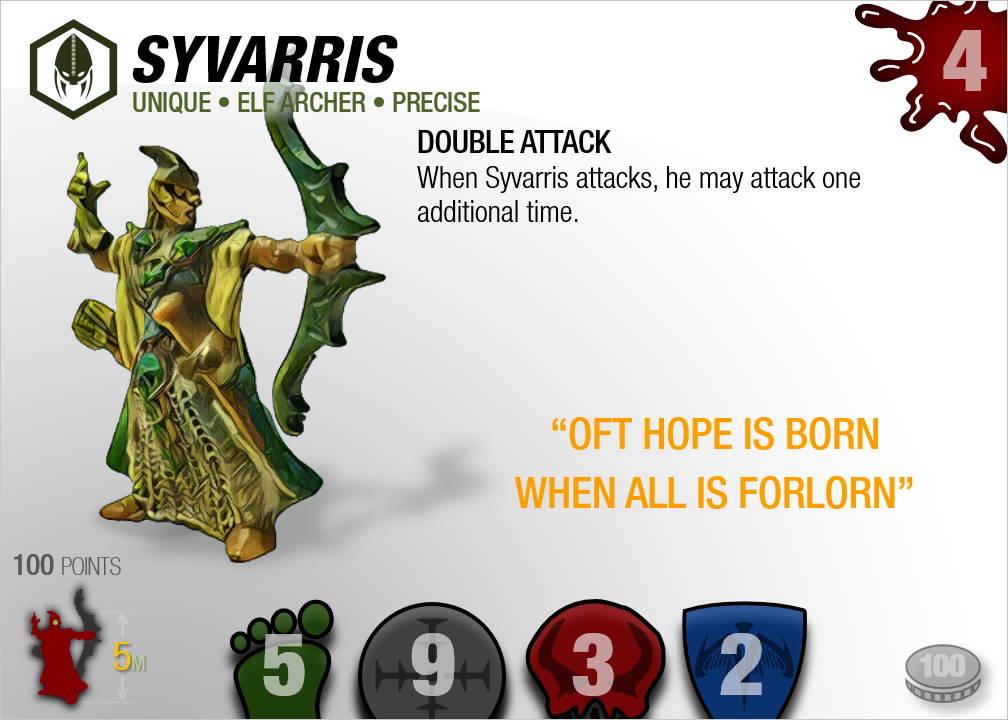
I agree with @AMIS on the coin thing, the way you have it in the first option on syvarris looks the cleanest. Oh man do I like this template. You captured simple yet elegant. Without all those extra lines and boxes. That's what had me on the fence with the rectangular cards. I liked the shape but not all those lines and boxes.

Check out my ebay where you can find my custom dice trays and dicetowers: https://www.ebay.com/usr/captainamazing_jerdo
|
|
#52
February 19th, 2017, 09:59 PM
|
||||
|
||||
|
Re: Smurf along with me: la la la-la la la!
I would fade the figure image a bit more when it gets in the way of the text: "Elf Archer" is a little hard to read.
I really like color-coding the bottom bar to match the general. I don't care much about the fade on the boder; if I had to pick I guess I'd take the outer shadow. I still like the coin but prefer the silver to the desaturated one. Discussion of layout is a bit premature without seeing what you have in store for a text-heavy squad. My preference between the different crosshairs was pretty marginal; that one is fine.
|
|
#53
February 20th, 2017, 10:48 AM
|
||||
|
||||
|
Re: Smurf along with me: la la la-la la la!
Wow, these look awesome. You have the height, but I don't see "large", "medium" etc for size. I prefer the more solid black line between the green and white section. The drop shadow approach feels to fuzzy for my taste.
It will be interesting to see how a card with mucho text works. Gorgeous cards! Edit: Scratch that, its the tiny "M" next to the height. My Custom Building Terrain Level Scape - Super simple RPG style character progression My TMNT Custom Units Laser etched replacement dice
|
|
#54
February 20th, 2017, 01:22 PM
|
||||
|
||||
|
Re: Smurf along with me: la la la-la la la!
I believe the M next to the 5 stands for medium.
Anyway you can shift the symbols up slightly so the skull is not cut off? A cloud can change its semblance, yet retain its will With the intimacy of destruction, One knows what it is to be alive The empty sky holds no reflection, for sorrow - Eslo Rudkey
|
|
#55
February 20th, 2017, 03:43 PM
|
|||||||||||||||
|
|||||||||||||||
|
Re: Smurf along with me: la la la-la la la!
Quote:
Quote:
Quote:
Quote:
Quote:
Regarding synergies getting long, yeah, the plan is to stuff the back with as much as can fit for a given unit. If something needs to be axed for space reasons on a card, I'll axe it. About the only things I for sure want on all the backs are the planet and wave info, since they're on official cards. Quote:
 I felt that as much as I wanted to avoid boxing things in that the colored bar on the bottom "grounded" the card in a good way. It has also ended up being useful to provide a color cue for the general, but that wasn't planned (since these were just Smurf cards to start with). Quote:
Quote:
Quote:
Quote:
Quote:
Quote:
Quote:
Quote:
Quote:
There is nothing more dangerous than sincere ignorance and conscientious stupidity. --MLK Last edited by Xorlof; February 20th, 2017 at 04:01 PM.
|
|
#56
February 20th, 2017, 05:41 PM
|
|||
|
|||
|
Re: Smurf along with me: la la la-la la la!
I'd keep the bottom box...if only for colour recognition of the general. I think the size letter height font may need to be the same as the number font for ease of reading...or I need my prescription checked.
Good trades with - Porkins / xraine69 / mac122 (x2) / frylock / Ztimster (x2) and probably others I forgotten to mention...sorry. Last edited by AMIS; February 20th, 2017 at 05:43 PM. Reason: Yes...my colour has a "U" in it. And my "Z" is pronounced "Zed"
|
|
#57
February 20th, 2017, 05:45 PM
|
||||
|
||||
|
Re: Smurf along with me: la la la-la la la!
Quote:
There is nothing more dangerous than sincere ignorance and conscientious stupidity. --MLK
|
|
#58
February 21st, 2017, 07:20 PM
|
||||
|
||||
|
Re: Smurf along with me: la la la-la la la!
Here's the Divider's card. Apologies in advance for the half-assed job on the graphics. Job #1 was to work on layout for this test (it's the first squad) and the graphics took a back seat.
For squads, I had envisioned only having one of the squad figures having a large image and then stacking, in either the x, y, or z axis, smaller images all of the remaining squad figures. I couldn't figure out a way to make that not look weird. The only remnant of that effort is in the hitzone chart. In the end, I did something pretty traditional:   The back is, once again, not well-styled. I will get to designing a style for the backs soon, but just haven't yet. I have some ideas to dress it up, but it will out of necessity always be lots-and-lots of text so it'll never be as cool as the front. The big question about the above graphic is, "what do you think about the concept of having abridged special power text on the front and unabridged on the back, for units with longer powers?" (Note the scissors indicating the abridgment). If your gut reaction is to not like it, I encourage you to sleep on it first. If your reaction is still negative, go ahead and let me know. As it turns out, in this case, abridging the text isn't necessary for the Dividers, nor do we even have to play around with crunching the text (or wrapping it around the mini graphic, or shrinking the mini graphic, or any of the other tricks we can do):   The next sample card, the Repulsors, will for sure require some trickery to make it work since it has so much text. If you don't mind the stacked hitzone graphics as shown above, there is plenty of room in the bottom shaded area for the coin option, even for squads with 4 (or 5) members. If you want to see a side-by-side hitzone option instead of stacked, let me know. Last issue--since these cards are for both Official and custom units, I'd like, if possible, for some sort of indicator on the front of the source of the unit. If we can't make that work it could go to the back (q.v., "OFFICIAL" on the bottoms of the backs above), but there are lots of options for the front. Here is a card with a bunch of them. To be clear, only one of these would be used!  I have several questions about this new territory: 1) We'd use C3V logos and such for customs, but what symbol should be used for official units? Look by the points display--I grabbed the H and S from the official Heroscape logo as options. Would either of those work? Other ideas? I want to avoid using the Hasbro, WotC, or full Heroscape logo. 2) Where should the symbol go? I show several options. Next to the points? Behind the special power text? Somewhere in the bottom bar? (If using the coin, it could stack above/below the coin). Somewhere else? 3) I have a few minor style treatments shown next to the "4M" unit size: plain, in the hex, some different shading. Like any of them? The other stuff mentioned in my previous post (black line option, showing bottom of skull option, adjusting range icon) are still in progress. I haven't lost track of them. Thank you to @Dad_Scaper for the perfect quote! There is nothing more dangerous than sincere ignorance and conscientious stupidity. --MLK Last edited by Xorlof; February 21st, 2017 at 08:02 PM. Reason: Fixing up this hurriedly done post.
|
|
#59
February 21st, 2017, 08:13 PM
|
||||
|
||||
|
Re: Smurf along with me: la la la-la la la!
I prefer unabridged text, and using flavor text only when space allows. I'm boring like that. I don't like the idea of flipping the card back and forth to access official wording during gameplay.
I'd prefer if only the customs got an extra symbol, and classic scape had no extra symbols. Really happy with how that middle one turned out.
|
|
#60
February 21st, 2017, 08:31 PM
|
||||
|
||||
|
Re: Smurf along with me: la la la-la la la!
Quote:
Check out my ebay where you can find my custom dice trays and dicetowers: https://www.ebay.com/usr/captainamazing_jerdo
|


 Linear Mode
