
|
|
|||||||
| Fan Art & Fiction Graphic & Literary works bound only by the imagination |
 |
|
|
Thread Tools | Search this Thread | Display Modes |
|
#37
 May 16th, 2006, 01:41 AM
|
|||
|
|||
|
why did you say "failed" those look fine.

|
|
#38
May 16th, 2006, 02:06 AM
|
||||
|
||||
|
Quote:
1) Jotun seemed bigger in the sketch 2) Jotun and the dangling minion are not so defined from one another. 3) not too exciting.
|
|
#39
May 16th, 2006, 05:40 AM
|
|||
|
|||
|
well i liked it. now draw all the heroscape girls go go now!
|
|
#40
May 16th, 2006, 06:48 AM
|
||||
|
||||
|
Again those are really awesome boss!!!
|
|
#41
May 16th, 2006, 09:55 AM
|
||||
|
||||
|
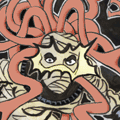
Hex, the mechanics of the Jotun picture are very solid. The drawing is very nice. But you're right, it lacks emphasis and definition, which is a defining characteristic in a lot of your art.
If you were to redo this drawing, I would move the angle up and to the right, so that we're looking down on Jotun, and the minion is held away from his body. Just a camera change would make it more dynamic, and it would allow you to separate Jotun from the minion. The other minion could still be coming up from behind. You might do what I do - grab a pad of scratch paper and fiddle around with poses until you find one that makes you say, 'aha! Now that's interesting!' It takes me, on average, four or five practice sketches before I can ever find the pose, angle and detail for any particular drawing. I still think it is a nice drawing. It's just not as awesome as some of your others; Tornak and the arrows is a fantastic example, or the zettians vs monks. Even your single poses are very dramatic - I love the Microcorp. http://drakesflames.blogspot.com Drake's Flames, my crassly opinionated game review site. Updates three times a week.
|
|
#42
May 16th, 2006, 11:34 AM
|
||||
|
||||
|
I agree with you and Imax, Hex. I love the original sketch but the ink took something away. For one, I thought Jotun was scowling in the sketch. In the final version he has a little grin as he admires his ragdoll.
You could do the pose as Imax recommended but have him turning his head to grin at the oncoming minion. Like, "Jotun like play wif silly red bats." || My Maps Review Blog || My Maps Thread || My Marvel Customs || Knights of the Daystorm || [/CENTER]
|
|
#43
May 16th, 2006, 11:39 AM
|
||||
|
||||
|
HEH your artistic skills amaze me!!!
Even what you call a "Failed" work is a masterpiece in my book. Just that fact that you can criticize such good work, makes you a master!!! If you have any other "failed" works. Please post those too... Us commoners would still love to see them. ODB Recent Games Played:
|
|
#44
May 16th, 2006, 01:34 PM
|
||||
|
||||
|
Great scene of Jotun and the Minions! HEH, you rock!
Newb.
|
|
#45
May 16th, 2006, 01:47 PM
|
||||
|
||||
|
Don't change the pose, not the problem.
The problem is in the inking. Varing the line wieght will go a long way improving this piece. What are you inking with? The background line are to heavy to have the foregoround figure pop out. To correct this ink the background in thinner lighter stokes and go heavy on the figure dangling. The shaded areas on the background need to hatched or washed instead of blacked out. Hatch the areas in the under the minions wings will allow you the create the illusion of depth and roundness in the figure form of Jotun's legs and toro tunic. Sorry to be so critical but I thought this might help you and others. It's a nice job that need a little TLC inking. Atmospro The Meaning of Life is to Give Life Meaning! The More I learn, the Less I know.
|
|
#46
May 16th, 2006, 05:48 PM
|
||||
|
||||
|
Thanks guys. Oogie, I wanted to post this mistake cuz I thought it would be fun to show something in progress and get some feedback and suggestions. And I got both. Thanks again to everybody who chimed in with suggestions or comments.
I will definitely try different poses and alter the inking for Jotun. I was in a hurry as I had 3 kids with me and luckily one was sleeping. So I wasn't as focused as I like to be with the thinking of the inking. Imax, I do try several poses, but in this instance I went with the 4th sketch that was starting to click. Again, time was a factor with my babysitting duties. It's funny, at some point, I knew I had lost the definition between Jotun and the Minion. But I went on and the composition never gave me that overall good feeling. It's times like these that I wish I drew and inked a lot more than I do. I spent the last 4-6 years drawing virtually nothing for my own pleasure. I'd be much more confident and flexible in my abilities. I like the comic book style as you all can see. If you asked me to draw from real life, it'd come out, just okay. But I don't mind. I like cartooning style. A lot. I have a scanner/copier/printer combination, so next time I may copy the pencils and try several inking processes. Thanks again for all the comments. I'm so eager to accept the challenge and get back to you all. It gives me the incentive, you know?
|
|
#48
May 16th, 2006, 07:08 PM
|
||||
|
||||
|
Quote:
I looooove underground comics.
|
|
|
|||||||
|
|
 Similar Threads
|
||||
| Thread | Thread Starter | Forum | Replies | Last Post |
| Thinking of offloading my heroscape stuff MS->W7->Sotm | Boromir_and_kermit | HeroScape General Discussion | 2 | April 14th, 2008 07:17 AM |
| Thinking of consolidating. | nyys | HeroScape General Discussion | 8 | September 21st, 2007 11:03 PM |
| Thinking About Star Wars | jaques | Other Media | 51 | August 10th, 2007 01:49 PM |
| Pricing: What were they thinking? | Elginb | HeroScape General Discussion | 10 | January 22nd, 2007 04:12 PM |
| EOV Master sets for $10! What were they thinking? | Country_Dragon | HeroScape General Discussion | 24 | December 7th, 2006 01:45 AM |


 Linear Mode
