Heroscapers
Go Back   Heroscapers > Marvel Legends HeroScape > Comic Hero Custom Creations
Comic Hero Custom Creations Any comic book customs and the discussions surrounding them


Reply
 
Thread Tools Search this Thread Display Modes
  #85  
Old February 23rd, 2017, 09:02 PM
AMIS AMIS is offline
 
Join Date: February 4, 2010
Location: Canada
Posts: 1,210
AMIS wears ripped pants of awesomeness AMIS wears ripped pants of awesomeness AMIS wears ripped pants of awesomeness AMIS wears ripped pants of awesomeness AMIS wears ripped pants of awesomeness AMIS wears ripped pants of awesomeness AMIS wears ripped pants of awesomeness
Re: Smurf along with me: la la la-la la la!

While I prefer the abridged don't make two different sets - too much work for not enough gain. Unabridged is alright (or all right depending on your view), I may just need to clean the glasses more often.

For the back; the colours, I like (the watermarks are very cool as well). If you keep the sections consistent then the headings are not required.

I still say bring in the BIO's when official and when not - make 'em up.

We have a lot of creative and talented folks to pull from on this site who know the background of many characters off by heart. Give them a shot or look to the writers of the site to come up with ideas. People like @The Grim Reaper's Friend and so forth. This is your project but the road to success doesn't need to be lonely. Which is obvious considering the number of folks giving you ideas along this.

And if we get the writers going...the quotes will flow.

Just when you thought it was all right, someone made it alright.

Good trades with - Porkins / xraine69 / mac122 (x2) / frylock / Ztimster (x2) and probably others I forgotten to mention...sorry.

Last edited by AMIS; February 23rd, 2017 at 09:05 PM. Reason: Let's not be divided...oh already done that one...
Reply With Quote
  #86  
Old February 23rd, 2017, 10:53 PM
mcmeeple's Avatar
mcmeeple mcmeeple is offline
 
Join Date: January 12, 2016
Location: USA - MO - St. Louis
Posts: 316
Images: 46
mcmeeple wears ripped pants of awesomeness mcmeeple wears ripped pants of awesomeness mcmeeple wears ripped pants of awesomeness mcmeeple wears ripped pants of awesomeness mcmeeple wears ripped pants of awesomeness mcmeeple wears ripped pants of awesomeness
Re: Smurf along with me: la la la-la la la!

Seeing this card and reading the other comments about text alignment I can't help but want to fiddle. What if the power text and the figure artwork were reversed. This would as you mentioned allow you to wrap text around the image in a more natural way when necessary. And unifying the title, sub text and powers into one visual element might help to simplify and balance the card. Feels like an idea worth trying anyway.


On the back I really really love how the color bands break up the content. Works really nicely.
Reply With Quote
  #87  
Old February 24th, 2017, 01:40 AM
Xorlof's Avatar
Xorlof Xorlof is offline
Super Smurfy
 
Join Date: February 22, 2011
Location: WI - Stevens Point
Posts: 3,116
Images: 17
Blog Entries: 5
Xorlof is a wielder of the Ban Hammer Xorlof is a wielder of the Ban Hammer Xorlof is a wielder of the Ban Hammer Xorlof is a wielder of the Ban Hammer Xorlof is a wielder of the Ban Hammer Xorlof is a wielder of the Ban Hammer Xorlof is a wielder of the Ban Hammer Xorlof is a wielder of the Ban Hammer Xorlof is a wielder of the Ban Hammer Xorlof is a wielder of the Ban Hammer Xorlof is a wielder of the Ban Hammer Xorlof is a wielder of the Ban Hammer Xorlof is a wielder of the Ban Hammer Xorlof is a wielder of the Ban Hammer Xorlof is a wielder of the Ban Hammer
Re: Smurf along with me: la la la-la la la!

Quote:
Originally Posted by TREX View Post
I gotta know what filter you are putting on the figure images. Is it photoshop or something similar?
Nah, it's super simple to do, and all the software is free. Let me see if there is any additional optimization to be had in the process (probably not) and I'll PM ya the full deets. I offered to post about it in one of the earlier posts, but you're the only person expressing interest.

Quote:
Originally Posted by TREX View Post
EDIT: the text looks great. I think it fits in there fine.
Quote:
Originally Posted by dok View Post
No complaints about the text for Augamo.

I mildly prefer headings for the text on the back but I don't feel strongly.
Cool regarding the Augamo text. Next stop is to try those C3G cards in case someone wants to use these for something with even more insane (in a good way) amounts of text.

I think I'm going to axe the headings on the back for good--the utility of having the extra space is just too good to pass up, and most people have said they're fine with it.

Quote:
Originally Posted by japes View Post
The one thing that looks questionable to me is that with this much text the balance seems off. I wonder if it would look better if the Life and General/name/attributes had their position mirrored at the top so that life was in the left corner and general symbol in the right corner with the unit name text aligned with the power text.

It may be too uniform for your look thought but just a thought.
I think I'll pass on that particular suggestion, if for not other reason that I have to make sure I leave enough space for long titles such as "Mezzodemon Warmongers" or "Axegrinders of Burning Forge," but thanks.

Quote:
Originally Posted by AMIS View Post
I still say bring in the BIO's when official and when not - make 'em up.
I'm not opposed to using unofficial bios if no official ones exist and an unofficial one takes care to not mess with what's canon lore-wise. I'd subtly, but visibly, mark them as unofficial, but a good short blurb of fiction can spice things up.

Quote:
Originally Posted by AMIS View Post
This is your project but the road to success doesn't need to be lonely. Which is obvious considering the number of folks giving you ideas along this.

And if we get the writers going...the quotes will flow.
Exactly. Everyone's been great. Especially considering this is a project that has morphed into for now primarily recreating C3V/SoV and official Valhalla cards (I'll circle back round to the Smurfs eventually) but whose thread is still in the Comic Customs area...all that outpouring of assistance is very generous and might even increase if moved to the proper area. (I like not having too many cooks for right now though--at the moment, I'm getting exactly the right amount of feedback).

Many hands make light work. After we're done tweaking templates and moving on to building cards, I'm hoping to get assistance from others in removing backgrounds from the mini images--that's by far the most time consuming part of putting together one of the cards and is work that can easily be spread among as many people as are willing. There are 365 different minis to do that on to make the 208 official Valhalla cards. Then we've got 90+ C3V/SoV cards to do! (@japes has been making playing card sized c3g cards recently so I don't see reason to move that direction for this project unless he decides he likes this template better and he wants to redo what he's already done using this one. His/JaB's template is probably better optimized for c3g though since powers tend to longer on them).

Quote-wise, so far (and we're just getting started) @Dad_Scaper has been insanely fast and unfailing in cheerfully finding cool quotes, so I don't think I need to look further unless he's having trouble with something, wants a break, or whatever. But if anyone's got a great idea for a quote, feel free to send it to me--you might be saving D_S an assignment.

Quote:
Originally Posted by mcmeeple View Post
Seeing this card and reading the other comments about text alignment I can't help but want to fiddle. What if the power text and the figure artwork were reversed. This would as you mentioned allow you to wrap text around the image in a more natural way when necessary. And unifying the title, sub text and powers into one visual element might help to simplify and balance the card. Feels like an idea worth trying anyway.
Yeah, but of the visual balance issues for Augamo wouldn't necessarily apply to other cards. The big visual tension is because of these two reasons: 1) his name is short and the special power text is long pulling visual weight toward opposite corners: the top-left and bottom-right, and 2) his name is short and his sculpt traps lots of white space on the left meaning the white space is also distributed in opposite corners: bottom-left and top-right. Neither of these things feels especially harmonious, but you wouldn't necessarily expect these to occur on most cards anyway.

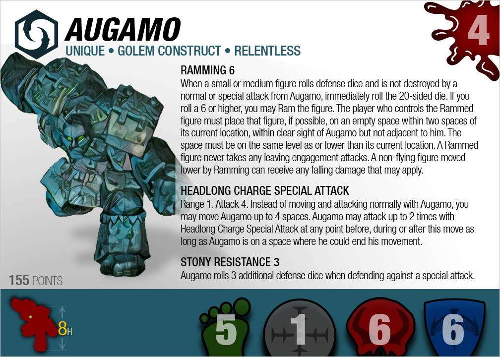
However, as stated earlier today (and you reinterated), it's probably worth exploring putting the mini image on the right because it is easier to wrap text around it if it is there. Below you will find the results of that for Augamo. Assuming you find it successful, remember that we're dealing with an unusual card here and the success may not apply to the general case. It would take more testing--we don't want to optimize for edge cases. But if y'all like the results, let me know and we can do further testing.

First, the original:


Now, three right-side-image variants (differing only in the bottom bar area):


There is nothing more dangerous than sincere ignorance and conscientious stupidity. --MLK
Reply With Quote
  #88  
Old February 24th, 2017, 02:09 AM
dok's Avatar
dok dok is offline
GenCon Main Event Champion - 2010, 2011, & 2017
 
Join Date: October 9, 2008
Location: USA - CO - Denver
Posts: 23,748
Images: 112
Blog Entries: 17
dok is a man of the cloth dok is a man of the cloth dok is a man of the cloth dok is a man of the cloth dok is a man of the cloth dok is a man of the cloth dok is a man of the cloth dok is a man of the cloth dok is a man of the cloth dok is a man of the cloth dok is a man of the cloth dok is a man of the cloth dok is a man of the cloth dok is a man of the cloth dok is a man of the cloth
Re: Smurf along with me: la la la-la la la!

I think the combination of aligning the power text under the figure name, and allowing the power text to fill in the white space more completely, makes the right-side image variant an improvement. Given that, I definitely prefer the unit stats on the left in the bottom bar and the hitzone/height/size on the right.

I have a mild preference for the last card over the second-to-last (i.e. height and size designation to the left of the hitzone) because I think this would look better for the squad version. It's a small preference though.

Side benefit of the side-swap: for figures where space allows (e.g. Syvarris) you could blow the figure image up a little and have it extend higher on the card. It's also fine if a figure image covers up some of the blood splatter. (I wouldn't mind if the blood splatter got pared back a little anyway, honestly.)

(There's something really gratifying about this iterative process of wringing the most value out of the limited real estate on the card.)

Last edited by dok; February 24th, 2017 at 12:14 PM.
Reply With Quote
  #89  
Old February 24th, 2017, 02:46 AM
Cavalier's Avatar
Cavalier Cavalier is offline
Trainer of n00bs
 
Join Date: August 16, 2006
Location: AZ - PHX Metro (Mesa)
Posts: 10,844
Images: 176
Cavalier is a man of the cloth Cavalier is a man of the cloth Cavalier is a man of the cloth Cavalier is a man of the cloth Cavalier is a man of the cloth Cavalier is a man of the cloth Cavalier is a man of the cloth Cavalier is a man of the cloth Cavalier is a man of the cloth Cavalier is a man of the cloth Cavalier is a man of the cloth Cavalier is a man of the cloth Cavalier is a man of the cloth Cavalier is a man of the cloth Cavalier is a man of the cloth
Re: Smurf along with me: la la la-la la la!

I would also be interested in your process for figure art.
Reply With Quote
  #90  
Old February 24th, 2017, 10:31 AM
mcmeeple's Avatar
mcmeeple mcmeeple is offline
 
Join Date: January 12, 2016
Location: USA - MO - St. Louis
Posts: 316
Images: 46
mcmeeple wears ripped pants of awesomeness mcmeeple wears ripped pants of awesomeness mcmeeple wears ripped pants of awesomeness mcmeeple wears ripped pants of awesomeness mcmeeple wears ripped pants of awesomeness mcmeeple wears ripped pants of awesomeness
Re: Smurf along with me: la la la-la la la!

One random bit. I was just wondering about the height indicator and number. These are very fine lines reversed out on a dark background. It might be worth doing a test print to make sure that the dark colors don't bleed and obscure the text/arrow.
Reply With Quote
  #91  
Old February 24th, 2017, 11:44 AM
TREX's Avatar
TREX TREX is offline
"like" happy
 
Join Date: February 24, 2010
Location: USA-ID-Preston
Posts: 8,270
TREX is hot lava death! TREX is hot lava death! TREX is hot lava death! TREX is hot lava death! TREX is hot lava death! TREX is hot lava death! TREX is hot lava death! TREX is hot lava death! TREX is hot lava death! TREX is hot lava death! TREX is hot lava death! TREX is hot lava death! TREX is hot lava death! TREX is hot lava death!
Re: Smurf along with me: la la la-la la la!

@Xorlof, this project is coming along nicely. Great work on this. I'm quite excited about it.

Check out my ebay where you can find my custom dice trays and dicetowers:
https://www.ebay.com/usr/captainamazing_jerdo
Reply With Quote
  #92  
Old February 24th, 2017, 11:57 AM
superfrog's Avatar
superfrog superfrog is offline
This is merely a joke.
 
Join Date: March 12, 2012
Location: USA - CA - San Gabriel
Posts: 12,174
Images: 46
Blog Entries: 3
superfrog is a man of the cloth superfrog is a man of the cloth superfrog is a man of the cloth superfrog is a man of the cloth superfrog is a man of the cloth superfrog is a man of the cloth superfrog is a man of the cloth superfrog is a man of the cloth superfrog is a man of the cloth superfrog is a man of the cloth superfrog is a man of the cloth superfrog is a man of the cloth superfrog is a man of the cloth superfrog is a man of the cloth superfrog is a man of the cloth
Re: Smurf along with me: la la la-la la la!

I think Augamo looks slightly better with left text. The problem with the right text, imo, is that the left justified line makes the card look blocky with all the text down the line. I think even deviating a little bit from the line (around his fist, for example) would break up that line a bit. So it wouldn't be all aligned with the miniature image, just in cases where it would overlap.

(I hope that makes any sense at all).

EDIT: I think in general, right text is better. Not designing for edge cases and all.
Reply With Quote
  #93  
Old February 24th, 2017, 12:10 PM
Dad_Scaper's Avatar
Dad_Scaper Dad_Scaper is offline. Isn't that smurfy?
Enjoy the Sausage
 
Join Date: January 3, 2007
Location: MD - Baltimore
Posts: 27,992
Images: 4
Dad_Scaper is a man of the cloth Dad_Scaper is a man of the cloth Dad_Scaper is a man of the cloth Dad_Scaper is a man of the cloth Dad_Scaper is a man of the cloth Dad_Scaper is a man of the cloth Dad_Scaper is a man of the cloth Dad_Scaper is a man of the cloth Dad_Scaper is a man of the cloth Dad_Scaper is a man of the cloth Dad_Scaper is a man of the cloth Dad_Scaper is a man of the cloth Dad_Scaper is a man of the cloth Dad_Scaper is a man of the cloth Dad_Scaper is a man of the cloth
Re: Smurf along with me: la la la-la la la!

The advantage of the image on the left is one of aesthetic design principles: The reader's eyes naturally flow from left to right. The figure on the left takes advantage of that, by introducing the figure to the reader before describing it.

On the other hand, the movement of the figure to the right allows for more efficient use of the space on the left. Augamo is an extreme case, but not the only text-heavy card, and in other cases the use of that space may allow for a larger font. Finally, an advantage of the figure being on the right is that you can clip a bit off, as you did here, and it doesn't look as unnatural as it would on the left, because the reader's eye is moving from the left - the complete side - to the right, where an insignificant piece is missing.

There is an advantage to the figure being on the left, and I suspect that a reader's intuitive expectation of it being there is why you started with it that way, Xorlof, whether you realized it or not. But on balance, the mechanical advantages of it being on the right overcome that virtue, I think. So keep it on the right.

Quote:
Originally Posted by dok View Post
It's also fine if a figure image covers up some of the blood splatter. (I wouldn't mind if the blood splatter got pared back a little anyway, honestly.)
I think the blood splatter is needlessly graphic, compared to the other icons. I think the blood drop is fine, but maybe more "drop" and less "splatter."

The designs of the Age of Annihilation, and their ACES compatibility with VC
C3V "Easily the best quality classic customs I have ever seen."
= =

Last edited by Dad_Scaper; February 24th, 2017 at 12:34 PM.
Reply With Quote
  #94  
Old February 24th, 2017, 12:29 PM
dok's Avatar
dok dok is offline
GenCon Main Event Champion - 2010, 2011, & 2017
 
Join Date: October 9, 2008
Location: USA - CO - Denver
Posts: 23,748
Images: 112
Blog Entries: 17
dok is a man of the cloth dok is a man of the cloth dok is a man of the cloth dok is a man of the cloth dok is a man of the cloth dok is a man of the cloth dok is a man of the cloth dok is a man of the cloth dok is a man of the cloth dok is a man of the cloth dok is a man of the cloth dok is a man of the cloth dok is a man of the cloth dok is a man of the cloth dok is a man of the cloth
Re: Smurf along with me: la la la-la la la!

The other aesthetic advantage of text on the left, as referenced by both japes and superfrog, is that you no longer have the enforced block feel of the text's left margin running down the middle of the card. All in all, the more I think about it, the more I am convinced it's a slam dunk to put the text on the left.

I understand why the blood splatter got there - it is, after all, the one icon that you could pull from the original cards. However, it does feel a little out of place with the aesthetic of this card. I very much like Dad_Scaper's suggestion of a drop of blood.

(Aside: the range icon seems like it will easily accomodate Deadeye Dan's 10 range, which means the icons are all well-sized for classic scape. C3G has to contend with Flash's 10 move, as well as a number of super-baddies that have high life totals, up to 30 and 40 for the biggest Event Heroes. My feeling is that it's OK if the numbers spill over the border of the icons for those edge cases.)
Reply With Quote
  #95  
Old February 24th, 2017, 12:58 PM
mcmeeple's Avatar
mcmeeple mcmeeple is offline
 
Join Date: January 12, 2016
Location: USA - MO - St. Louis
Posts: 316
Images: 46
mcmeeple wears ripped pants of awesomeness mcmeeple wears ripped pants of awesomeness mcmeeple wears ripped pants of awesomeness mcmeeple wears ripped pants of awesomeness mcmeeple wears ripped pants of awesomeness mcmeeple wears ripped pants of awesomeness
Re: Smurf along with me: la la la-la la la!

After contemplating the layout this morning I really agree with the other folks - I like the left side text a lot better. I really like how it unifies with the heading text (name etc). It just feels like a much tighter lockup.

I also agree with the questions about the blood splatter. Not so much that it is a blood splatter but the general aesthetic or style. It kind of has that glossy look going, while the icons and the rest of the card are fairly flat and make use of shadow gradients. I think it might tighten the design even more if you explore so similarly styled icons (blood drop, splatter etc).

This is my preferred configuration of the footer:


One upside I see about the image on the right is greater room for overlap of space. I like how the sample guy here breaks the border along the top. It avoids overly putting things into boxes and I think it works well. A fine example is Grishnakhs super hero cards, the way he overlaps the artwork onto the card is just beautiful. This situation doesn't offer quiet that level of opportunity, but breaking the borders can, in my opinion, really help to unify the card in a wonderful way. Not to mention it allows the figures art to be as large as possible, which seems like a really good thing.
Reply With Quote
  #96  
Old February 24th, 2017, 01:13 PM
TGRF's Avatar
TGRF TGRF is offline
He should definitely get that. (#4)
 
Join Date: September 19, 2010
Location: USA - ID - Post Falls
Posts: 7,625
Images: 8
Blog Entries: 139
TGRF is inducted into the Halls of Valhalla TGRF is inducted into the Halls of Valhalla TGRF is inducted into the Halls of Valhalla TGRF is inducted into the Halls of Valhalla TGRF is inducted into the Halls of Valhalla TGRF is inducted into the Halls of Valhalla TGRF is inducted into the Halls of Valhalla TGRF is inducted into the Halls of Valhalla
Re: Smurf along with me: la la la-la la la!

Quote:
Originally Posted by AMIS View Post
While I prefer the abridged don't make two different sets - too much work for not enough gain. Unabridged is alright (or all right depending on your view), I may just need to clean the glasses more often.

For the back; the colours, I like (the watermarks are very cool as well). If you keep the sections consistent then the headings are not required.

I still say bring in the BIO's when official and when not - make 'em up.

We have a lot of creative and talented folks to pull from on this site who know the background of many characters off by heart. Give them a shot or look to the writers of the site to come up with ideas. People like @The Grim Reaper's Friend and so forth. This is your project but the road to success doesn't need to be lonely. Which is obvious considering the number of folks giving you ideas along this.

And if we get the writers going...the quotes will flow.
*spluttered coughing* Huh? What? Someone mention me?

~TGRF, not quite sure what's going on here.
Reply With Quote
Reply

Go Back   Heroscapers > Marvel Legends HeroScape > Comic Hero Custom Creations


All times are GMT -4. The time now is 04:21 AM.

Heroscape background footer

Powered by vBulletin® Version 3.8.8
Copyright ©2000 - 2024, vBulletin Solutions, Inc.
User Alert System provided by Advanced User Tagging (Lite) - vBulletin Mods & Addons Copyright © 2024 DragonByte Technologies Ltd.