
|
|
|||||||
| Fan Art & Fiction Graphic & Literary works bound only by the imagination |
 |
|
|
Thread Tools | Search this Thread | Display Modes |
|
#121
 August 8th, 2011, 05:11 PM
|
||||
|
||||
|
Re: New Font Design 8/8/11
Sorry double post.
C3V/SoV The Pre-Sov Workshop Xorlof's Handy-Dandy Card Creator My Customs: Ullar Cavalry Faction, 4/24/23 HOW I GOT MY TITLE 
|
|
#122
August 8th, 2011, 05:13 PM
|
||||
|
||||
|
Re: New Font Design 8/8/11
Quote:
C3V/SoV The Pre-Sov Workshop Xorlof's Handy-Dandy Card Creator My Customs: Ullar Cavalry Faction, 4/24/23 HOW I GOT MY TITLE
|
|
#123
August 8th, 2011, 07:15 PM
|
||||
|
||||
|
Re: New Font Design 8/8/11
Quote:
|
|
#124
August 8th, 2011, 08:05 PM
|
||||
|
||||
|
Re: New Font Design 8/8/11
Quote:
Quote:
I think you are right, mac. The "f" does need more of ascender rather than a descender. I will have some more concept work ready soon and your input is always appreciated.
|
|
#125
August 9th, 2011, 12:41 PM
|
||||
|
||||
|
Re: New Font Design 8/8/11
Thanks to DS I have a whole lot of work to do on this font
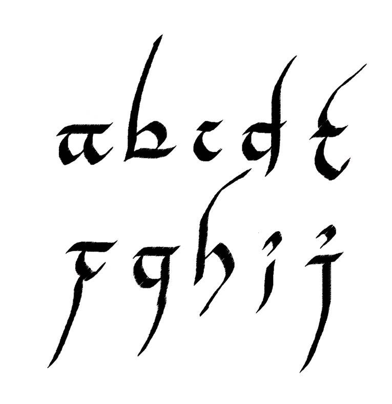
I am going through the Tengwar Annatar "alphabet" (the script on the One Ring is a form of Tengwar that was used by Sauron when he first forged the rings. He was going by the alias of Annatar at the time). I am looking at all the diacritical marks and such to see what would best represent our own letters and adapting them. What I have so far is a sample of some of them. A lot of them will be changing and I haven't started on the Upper Case letters yet... 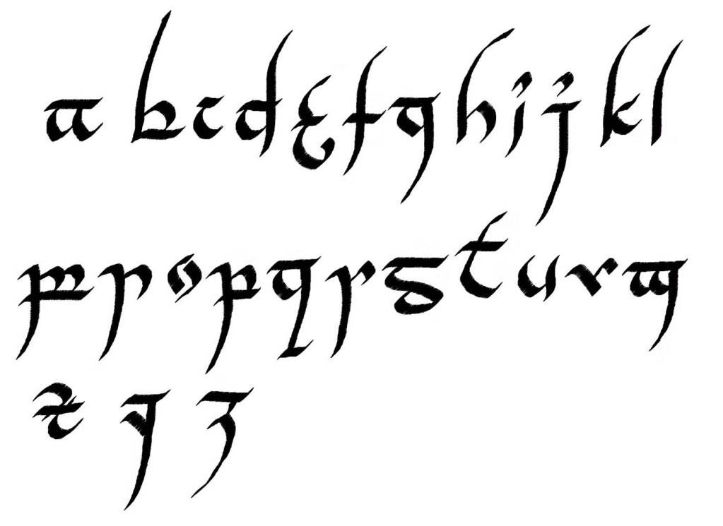 I haven't settled on the style of the "m", "n", "p", or "y" yet. I am not satisfied with the "x" or "v" either. Any thoughts?
|
|
#126
August 9th, 2011, 01:12 PM
|
||||
|
||||
|
Re: New Font Design 8/8/11
Quote:
Spoiler Alert!
This would obviously need your much stronger computer-ligraphic skills.
|
|
#127
August 9th, 2011, 01:17 PM
|
||||
|
||||
|
Re: New Font Design 8/8/11
Quote:
Are you sure you don't want to take on a unique and rewarding experience designing fonts that I can then take all the credit for? Thanks for the ideas; I'll run with them (with the pointy sides down of course).
|
|
#128
August 9th, 2011, 01:25 PM
|
||||
|
||||
|
Re: New Font Design 8/8/11
Quote:
 Now I know what I've been doing wrong! Now I know what I've been doing wrong!Thanks for the kind words, but I'll leave the really creative stuff to you.
|
|
#129
December 21st, 2011, 06:00 PM
|
||||
|
||||
|
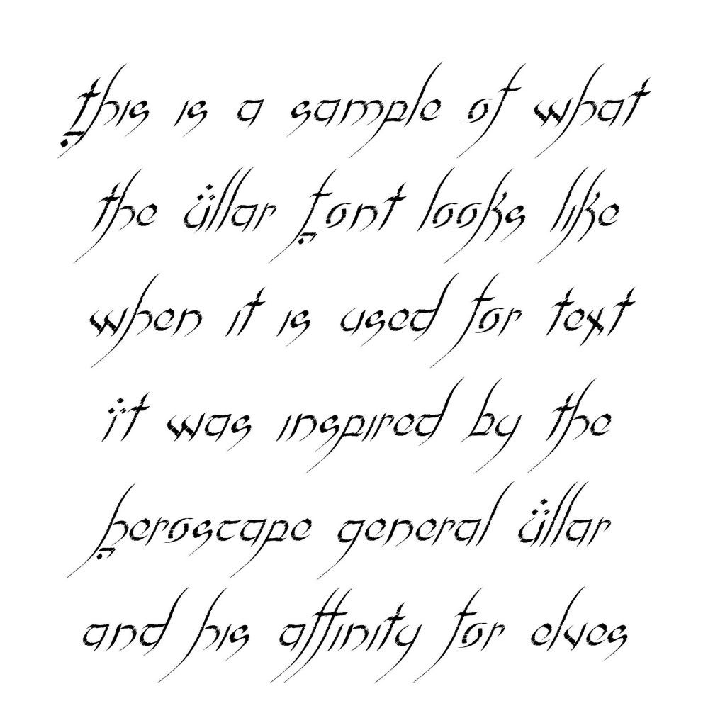
Re: Ullar Font 12/21
After several months (this was a difficult font to design) I finally have the Ullar Font ready (well, I don;t have the numbers or punctuation yet, but I will).
I wanted to give a small Christmas present to the community, so, Merry Christmas!!! Due to the limitations of my program I had to create it at a small point size so it will need to be used at larger point sizes to look best. 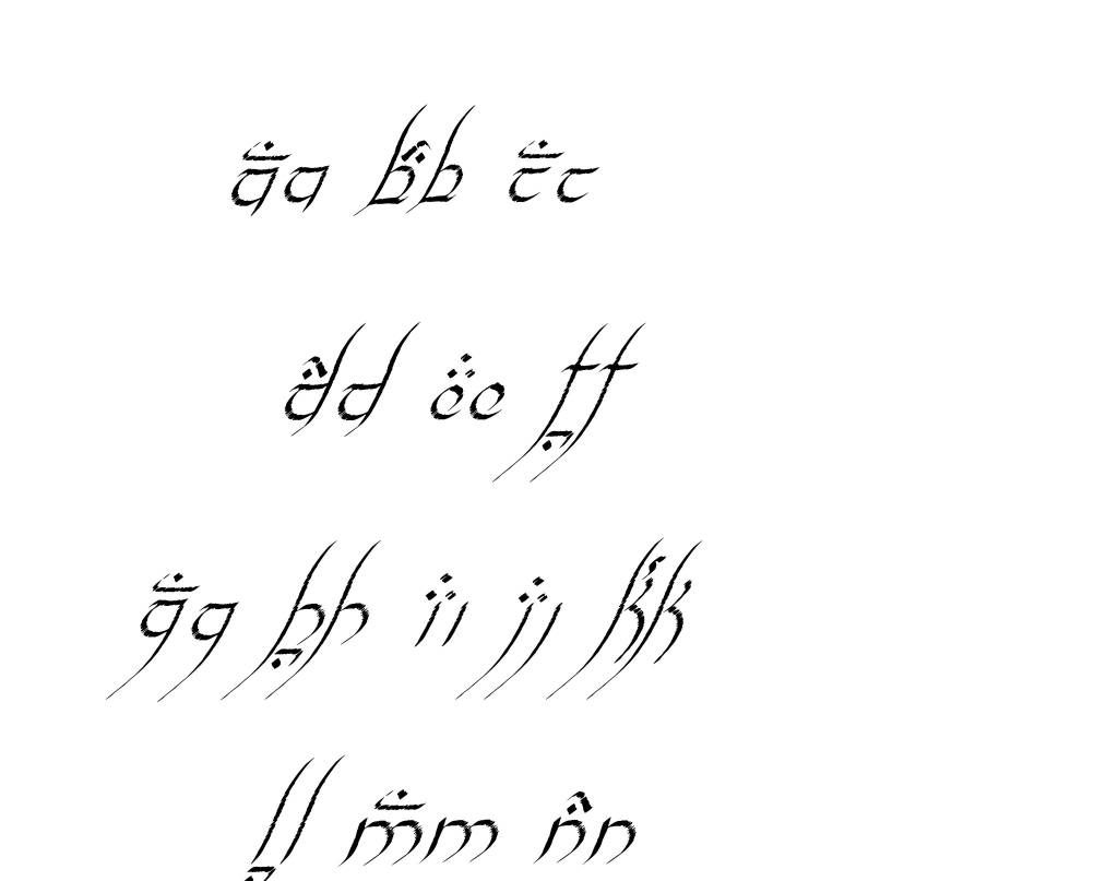 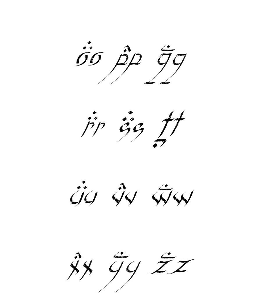  See the OP for the download link.
|
|
#130
December 22nd, 2011, 01:09 PM
|
||||
|
||||
|
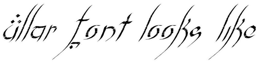
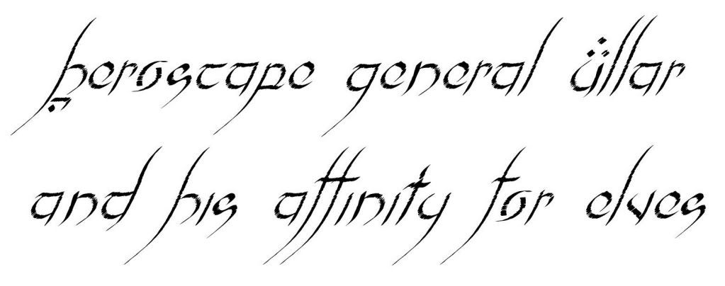
Re: Ullar Font 12/21
I just wanted to post some text samples that also show the texture of the font and what it looks like when used:
|
|
#131
November 29th, 2012, 04:12 PM
|
||||
|
||||
|
Re: Ullar Font 12/21
Wow! It has been almost a year since I posted anything here.
I have been batting around a few ideas for an Utgar font. I wanted something bold and strong but also something that could convey the horrific and primal side of Utgar. Here is a concept of what I had in mind... 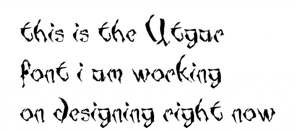 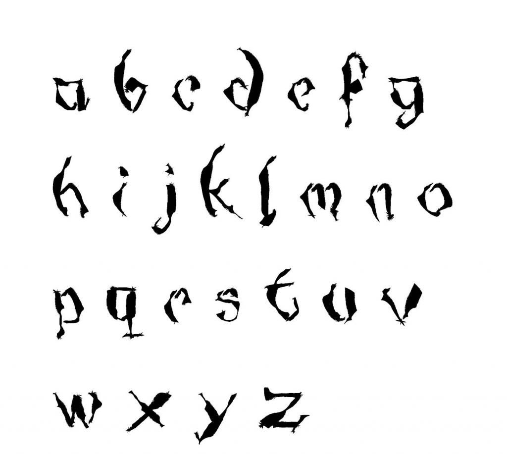 As always, any ideas or input is appreciated and looked for.
|
|
#132
November 30th, 2012, 01:28 AM
|
||||
|
||||
|
Re: Utgar font idea 11/29
It looks pretty good to me. I like the way it conveys roughness, almost as if the words were hewn out of stone or something. The wider parts of the letters really help to beef it up and make it look bolder. That, combined with the general two slants of the letters and the uneven width, work to convey someone writing fast, with a purpose. It's almost the kind of writing I'd expect Utgar to turn out if he were to quickly write something. Well done.
~TGRF.
|
|
|
|||||||
|
|
 Similar Threads
|
||||
| Thread | Thread Starter | Forum | Replies | Last Post |
| I'm just not Inspired | Archkyrie11 | HeroScape General Discussion | 26 | March 24th, 2010 04:36 PM |
| Marvel fonts and sizes | MacG | Comic Hero Custom Creations | 31 | November 2nd, 2007 11:20 PM |
| fonts | Tholarthemag | General | 6 | May 25th, 2007 09:14 AM |
| I have been inspired | K/H_Addict | Maps & Scenarios | 2 | October 4th, 2006 09:29 PM |


 Linear Mode
